Digital Marketing
Jun 22, 2025
Learn essential mobile-first design principles to enhance user experience, boost performance, and ensure accessibility across all devices.
Over 60% of global website traffic comes from mobile devices. If your site isn’t optimized for mobile, you’re losing visitors and conversions. Mobile-first design ensures your website is fast, user-friendly, and accessible on any device.
Here’s a summary of the 7 principles you need to know:
Simple Layouts: Clean, uncluttered designs for smaller screens.
Content Prioritization: Highlight the most important information first.
Touch-Friendly Navigation: Buttons and menus designed for easy tapping.
Fast Loading Speeds: Reduce load times to keep users engaged.
Progressive Development: Start with core features and scale up for larger screens.
Readable Typography: Use clear fonts, proper spacing, and accessible sizes.
Accessibility Features: Design for everyone, including users with disabilities.
Why it matters: A one-second delay in load time can reduce conversions by 7%, and 88% of users won’t return to a site after a poor mobile experience. By focusing on these principles, you’ll create a website that works seamlessly for mobile users - and improves performance on all devices.
What Is The Mobile-First Design Approach? - Next LVL Programming
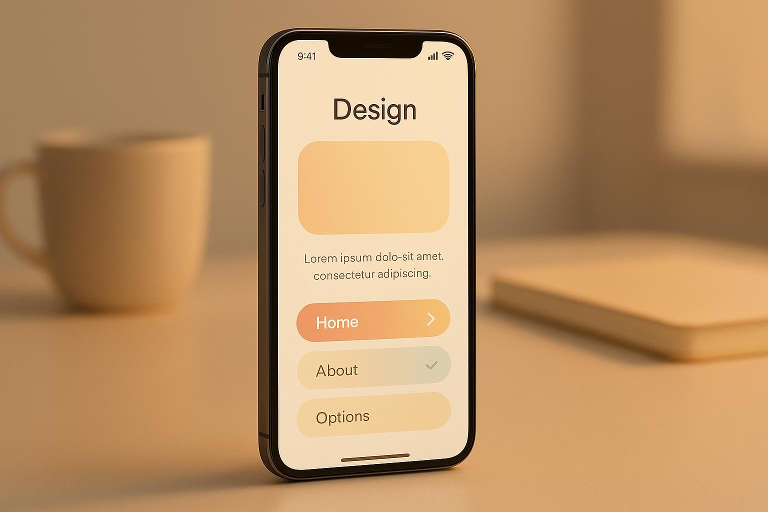
1. Simple Layout Design
Designing with simplicity in mind is crucial for mobile-first experiences, especially given the constraints of smaller screens. Clean, uncluttered layouts that prioritize the most important information not only enhance usability but also lead to better results.
"Mobile-first design is not just about designing for small screens; it's about embracing a mindset that prioritizes simplicity, performance, and user-centricity." - Mirza Arsalan Ahmed, Designer Diaries [3]
Optimized for Small Screens
Mobile screens demand a streamlined approach. A single-column layout paired with hamburger menus helps emphasize essential content while keeping the interface tidy. Avoid intrusive elements like disruptive pop-ups, which can frustrate users.
Hamburger menus, in particular, are effective for revealing secondary features without overwhelming the main interface. This ensures that critical elements remain front and center while still providing easy access to additional functions when needed.
Take Flipkart, for example. The e-commerce giant embraced a mobile-first strategy by focusing on fast load times, simplified navigation, and user-friendly design. This approach led to a significant increase in mobile transactions, with the majority of the company's sales now coming from mobile devices [4].
This kind of thoughtful, streamlined design lays the foundation for a seamless user experience.
Improves User Experience
Simple layouts improve clarity and make navigation intuitive, keeping users engaged and focused. When interfaces are easy to follow, retention rates naturally improve. The goal should always be to provide just the right information at each stage of the user journey, avoiding the temptation to overload visitors with too many options.
A great example is X (formerly Twitter), which launched its first mobile app back in 2010. Recognizing the growing importance of mobile, the app included features like real-time updates and notifications, allowing users to effortlessly like, share, or comment on posts. This user-friendly approach not only expanded X's audience but also cemented its role as a go-to platform for real-time communication [6].
By focusing on usability, businesses can enhance both user satisfaction and overall performance.
Enhances Performance
Simplified layouts and intuitive navigation directly impact loading speeds - an essential factor, especially on slower networks. A well-organized interface ensures that users can access what they need quickly.
Spotify's entry into the mobile space in 2011 is a perfect example of this. The music streaming service adopted a mobile-first design that prioritized user experience. Features like playlists, offline listening, and personalized recommendations were tailored specifically for mobile users. This approach not only helped Spotify expand into markets where smartphones were the primary internet access point but also boosted user retention and increased premium subscriptions [6].
Fast, efficient interfaces are key to keeping users engaged and satisfied.
Supports Accessibility and Inclusivity
Simple layouts that use clear fonts, high contrast, and logical organization improve accessibility for all users, including those relying on assistive technologies. Straightforward language and a purposeful design help ensure everyone can navigate and interact with the interface effectively.
"Mobile-first design simplifies interfaces, prioritizes essential content, and enhances readability with legible fonts and high contrast, making it easier for users with disabilities to navigate and interact." - BrowserStack [1]
Statistics show that 61% of users are unlikely to return to a mobile site if they encounter accessibility issues, and 40% will turn to a competitor instead [8]. By eliminating barriers through thoughtful design, you create a more inclusive and welcoming experience for all users. In a mobile-first world, every design choice must serve a clear purpose.
2. Content Prioritization
When it comes to mobile-first design, content prioritization is a game-changer. It’s not just about squeezing content onto a smaller screen - it’s about creating a thoughtful hierarchy that highlights what users need most. With limited screen space, every element on a mobile interface has to justify its presence.
Optimized for Small Screens
Mobile screens leave no room for clutter, so focusing on the essentials is critical. A clear content hierarchy ensures users can immediately identify the main task. For example, a single, prominent button for the primary action simplifies navigation and makes the purpose of the interface crystal clear [9]. This approach is especially important when you consider that, as of September 2023, 52.92% of global webpage views came from mobile devices [11]. By prioritizing key elements, users can find what they need quickly without endless scrolling or zooming. The result? A cleaner, more user-friendly experience.
Improves User Experience
Streamlined content doesn’t just save space - it makes navigation intuitive and keeps users engaged. In the U.S., people spend about 90% of their mobile time on apps and mobile internet [12]. With this kind of usage, creating an interface that’s easy to navigate isn’t just nice to have - it’s essential.
Enhances Performance
Prioritizing content also boosts performance. By focusing on the most important elements first, designers can implement techniques like lazy loading for images and deferring non-essential content [10]. Combine this with strategies like image compression and minimizing HTTP requests, and you’ve got a recipe for faster load times. Quicker access to information means lower bounce rates and higher engagement, all while supporting the broader goals of mobile-first design.
Supports Accessibility and Inclusivity
Content prioritization isn’t just about usability - it’s also about making digital spaces more accessible. By eliminating unnecessary clutter, designers can create interfaces that are easier for everyone to use, including individuals with disabilities or those relying on assistive technologies [13]. With around 1.3 billion people worldwide living with significant disabilities [14], this approach is not just thoughtful - it’s necessary. Using straightforward language and proper heading structures ensures that platforms are inclusive and functional for all.
A great example of this is the DashDevs digital banking platform. They prioritized accessibility by incorporating features like language localization for English and Arabic (including right-to-left layouts), high-contrast color schemes that follow WCAG guidelines, and customizable text sizes. The result? A banking app that’s not only user-friendly but also meets global accessibility standards, resonating with a diverse audience [14].
3. Touch-Friendly Navigation
Touch-friendly navigation is a must-have for mobile design. With over 60% of global web traffic coming from mobile devices [17], creating interfaces that respond smoothly to taps and gestures can make or break a user's experience. The difference between frustration and ease often boils down to how well navigation elements are designed for fingers instead of mouse cursors.
Optimized for Small Screens
Small screens require careful attention to sizing and spacing. Navigation buttons should be at least 48 pixels in size, with a minimum of 32 pixels of space between interactive elements [16][19]. This helps prevent accidental taps and supports a smoother interaction. Primary calls-to-action should stand out with larger sizes, while secondary elements should still meet these minimum standards.
Consider how real-world apps apply this. The Secondhand App uses a prominent plus button as a clear focal point, while the Cryptocurrency App keeps its navigation simple with four well-spaced icons - Home, Assets, Trade, and Profile - each highlighted to show the current selection [18].
Improves User Experience
Touch-friendly designs directly impact user satisfaction, with 74% of users saying they prefer smooth mobile experiences [19]. Placing key navigation elements within easy thumb reach makes apps and websites more intuitive to use.
For instance, drop-down menus should activate with a tap instead of requiring mouseover actions. They should expand when tapped and close when users tap outside the menu area [16]. These small details make a big difference in usability.
Enhances Performance
Efficient touch navigation minimizes unnecessary taps and streamlines actions. Features like swipe gestures simplify tasks - horizontal swipes can move users between pages, while vertical swipes enable scrolling or reveal more options. Popular interactions like swipe-to-delete, swipe-to-archive, and pull-to-refresh save time and improve workflow.
Using CSS media queries to adjust navigation layouts based on screen size and orientation ensures touch targets remain functional across all devices [16]. These tweaks embody a mobile-first approach, reducing friction in every interaction.
Supports Accessibility and Inclusivity
Well-designed navigation doesn’t just improve functionality - it also makes digital experiences more inclusive. Properly sized and spaced elements help people with varying motor skills, dexterity, or visual impairments use apps and websites more effectively [16][20]. High contrast between navigation elements and backgrounds enhances visibility for users with visual challenges, while pairing icons with clear labels ensures everyone can quickly understand their options [16].
"Mobile design is a balancing act between functionality and simplicity, in which the goal is to create a user experience that is easy to use for all." - Magnus Eriksen, Freelance Copywriter and Ecommerce SEO Specialist [20]
The Flight Booking App is a great example of inclusive design. It features large, easy-to-read labels for destinations like "Tokyo (TYO) to San Francisco (SFO)" alongside neatly organized flight details such as departure times, durations, and flight numbers [18]. Additionally, with 27% of mobile users globally relying on voice navigation [19], touch-friendly design should complement voice commands, offering multiple ways for users to achieve their goals. By focusing on both practicality and accessibility, mobile-first navigation sets the stage for even greater usability and performance improvements.
4. Fast Loading Speed
Fast loading speed is the backbone of effective mobile-first design. With more than half of global internet traffic coming from mobile devices and 60% of e-commerce sales happening via mobile [21], speed is no longer optional - it’s critical for keeping users engaged and driving conversions.
Improves User Experience
Mobile users expect quick-loading pages, and delays can push them away in seconds. Nearly half of users (47%) won’t wait more than two seconds for a page to load [23], and about 40% will leave a site if it takes longer than three seconds [22]. The consequences are immediate: every one-second delay reduces user satisfaction by 16%, and 64% of dissatisfied shoppers won’t return to a slow site [28]. Moreover, 70% of consumers say page speed directly influences their purchasing decisions [28]. Even slight delays can wreak havoc on bounce rates, with a few extra seconds causing them to spike by 32% to 123% [28].
Prioritizing speed not only keeps users happy but also delivers measurable results.
Enhances Performance
The relationship between speed and performance is undeniable. A one-second delay can slash conversions by 7% [22]. Real-world examples highlight the impact of speed improvements: Amazon boosted revenue by 1% for every 100 milliseconds shaved off load times, Shopzilla increased revenue by 12% by reducing load time from 6 seconds to 1.2 seconds, Walmart doubled its conversion rates when page speeds went from 3-4 seconds to 1-2 seconds, and Mozilla gained 60 million extra Firefox downloads by cutting load times by 2.2 seconds [24].
These improvements are particularly important for mobile users, who often face hardware and connectivity challenges.
Optimized for Small Screens
Mobile devices frequently operate on slower processors and less reliable connections [25]. Mobile-first designs address these limitations by creating lighter web pages and applications for faster loading [21]. Google recommends aiming for page load times under 3 seconds - ideally closer to 1 or 2 seconds [25]. Achieving this involves strategies like reducing round trip requests (keeping them under 50), combining CSS and JavaScript files, compressing content with Gzip, and using efficient image formats like JPG for photos and GIF for icons [25]. Lazy loading, where images and videos load only as needed, can also significantly improve speed.
Supports Accessibility and Inclusivity
Fast loading speeds don’t just enhance performance - they’re crucial for accessibility. Slow-loading pages can interfere with assistive technologies like screen readers, making navigation harder for users with disabilities [26]. Quick load times ensure these technologies work seamlessly. For example, one web development agency reduced a site’s load time from 5 seconds to under 2 seconds, improving accessibility for screen reader users and boosting search engine rankings by 20% [26]. Speed optimization also benefits users on limited data plans or slower internet connections by ensuring critical content loads first [29].
"Performance is PART of Accessibility – it's a subset. When you optimize performance, you optimize accessibility too." - Scott Jehl [27]
Fast loading speeds tie together mobile-first design by improving usability for all users, regardless of their circumstances.
5. Progressive Development
Progressive development is at the heart of mobile-first design. It starts by focusing on essential features that work effortlessly on smartphones and gradually adds more advanced functionalities as devices grow in screen size and capability. With mobile devices driving over 64% of web traffic [1], this approach ensures that core features are optimized for all users, regardless of their device. By layering features strategically, progressive development aligns perfectly with user experience, performance, and accessibility goals, which are explored further in the following sections.
Optimized for Small Screens
Small screens come with unique challenges, and progressive development tackles them by prioritizing essential functionalities. Designers first focus on delivering features that fit well within the constraints of smartphones and tablets. As screen size increases, additional enhancements - like high-resolution images, videos, and more complex layouts - are introduced [60, 61]. This method ensures that smartphone users enjoy a fast, lightweight experience while larger screens can handle richer, more detailed content [5].
Improves User Experience
This approach ensures that websites remain functional and user-friendly across all devices. By focusing on what truly matters, designers create streamlined experiences that work well for everyone, whether they’re using an older smartphone or the latest tablet [31]. Core functionalities such as navigation and content display are accessible to all, without sacrificing usability.
"The mobile-first approach is a tenet of progressive enhancement. It is the ideology that mobile design, as the hardest, should be done first. Once the mobile design questions are answered, designing for other devices will be easier. What it boils down to is that, the smallest of the designs will have only the essential features, so right away you have designed the heart of your UX." – UXPin [2]
Enhances Performance
By starting with a lightweight, mobile-first foundation, progressive development naturally boosts performance. It avoids loading unnecessary resources, like desktop-specific JavaScript, large images, or complex animations, on devices that don’t need them [64, 65]. This approach not only speeds up loading times but also enables advanced features - such as offline support and push notifications - on devices that can handle them [31]. The result? A faster, smoother experience for all users.
Supports Accessibility and Inclusivity
Progressive development simplifies interfaces, making them more accessible to everyone. By prioritizing essential content and using high-contrast, readable fonts, it ensures usability across different devices and connection speeds [1]. Assistive technologies function seamlessly, providing universal access to core content. Meanwhile, more advanced devices benefit from features like hover effects and keyboard shortcuts, creating a balanced experience for all users [30]. This method ensures consistency and adaptability, regardless of the user’s device or browsing environment [5].
6. Readable Typography
Typography is the backbone of mobile communication, with a staggering 90% of online information presented in text form [33]. When users find it difficult to read content on their smartphones, 73% simply abandon it due to poor readability [34]. That’s why clear and legible typography is so important - it directly affects user engagement and makes content more accessible. Just like simple layouts and touch-friendly navigation improve usability, well-thought-out typography ensures that your content remains easy to read and engaging on mobile devices. Let’s explore how typography choices can adapt to mobile constraints and improve user interactions.
Optimized for Small Screens
Mobile screens come with unique challenges, especially when it comes to fitting text into limited space. Sans-serif fonts, such as Arial or Helvetica, are preferred by 80% of users for their clean, easy-to-read design [35]. For body text, a 16px font size is a solid starting point, though you might need to tweak it depending on your content [32].
Line spacing also plays a big role. A line height set to about 1.5 times the font size gives the text enough breathing room, while keeping line lengths between 50–75 characters makes scanning easier [35]. To ensure your typography adjusts seamlessly across devices, use relative units like percentages, ems, or rems instead of fixed pixel values. Media queries can further refine these settings for different screen sizes [32].
Improves User Experience
Good typography doesn’t just look nice - it significantly enhances the user experience. Since mobile users tend to read 20–30% slower than desktop users [35], every decision about your text matters. Clear, legible typography not only boosts interaction but also builds trust in your brand [33]. In fact, 58% of users prefer larger font sizes, making it essential to cater to a variety of preferences [34].
A strong typographic hierarchy helps users digest information at a glance [32]. By differentiating headings from body text with varying font sizes, weights, and styles, you can improve information retention by 49% [35]. Adding white space around text reduces cognitive load, making content feel more approachable and easier to read [32]. Well-spaced content can enhance user retention by as much as 40% [35].
Enhances Performance
Typography choices can also impact how quickly your pages load. For example, using the CSS property font-display: swap ensures that users see text immediately, even if custom fonts take a moment to load [32]. Sticking to two or three typefaces minimizes the number of font files your site needs to download, and using system or web-safe fonts can further speed things up. On top of that, proper line spacing can improve reading speed by 20% [35].
Supports Accessibility and Inclusivity
Accessible typography ensures that your content is usable for everyone, including people with visual impairments or other challenges [36]. For instance, a minimum body font size of 14px improves readability for over 70% of users with visual impairments [35]. Additionally, 92% of individuals with low vision struggle with poor contrast, so maintaining a contrast ratio of at least 4.5:1 between text and background is crucial for readability in various lighting conditions [35].
Left-aligned text is another accessibility win, as 80% of people with dyslexia find it easier to read [35]. Features like responsive text scaling and customizable font sizes empower users to tailor their reading experience to their needs.
Here’s a quick reference for optimal font size and line height combinations:
Font Size | Recommended Line Height |
|---|---|
14px | 21px |
16px | 24px |
18px | 27px |
20px | 30px |
About 75% of users prefer text that’s easy to read without zooming, and poorly sized text can lead to a 30% increase in bounce rates [35]. These numbers emphasize how accessible typography isn’t just user-friendly - it’s also good for business.
7. Accessibility Features
Accessibility features are a cornerstone of creating inclusive mobile-first designs. With 1.3 billion people worldwide living with disabilities, making mobile experiences accessible isn’t just ethical - it’s smart. Users tend to stay loyal to brands that prioritize inclusivity. In mobile-first design, accessibility isn’t an afterthought - it’s baked into the foundation, supporting speed, clarity, and trust.
"Accessibility and inclusivity are branches of usability. They are mindsets rather than collections of procedures, regulations, or checklists." - Tanner Kohler [37]
Optimized for Small Screens
Designing for small screens comes with its own set of challenges, especially for users with disabilities. Mobile-first design helps tackle these issues by focusing on practical solutions. For example, touch targets should be at least 48x48 pixels [41], ensuring users - especially those with motor impairments - can tap accurately without triggering nearby elements.
Navigation should be straightforward. Clear labels, intuitive hamburger menus, and breadcrumbs make it easier for users, including those with cognitive challenges, to find their way around [7] [40].
Using fluid grids, flexible images, and CSS media queries ensures accessibility remains intact no matter how the screen is oriented. This is particularly important because assistive technologies often behave differently depending on whether the device is in portrait or landscape mode [40].
Improves User Experience
Accessibility isn’t just for people with disabilities - it enhances the experience for everyone. Features like high-contrast color schemes and a minimum font size of 16px improve readability in any lighting condition [14] [40].
Voice navigation and natural language interactions are game-changers. For instance, apps like Keen allow users to ask questions such as, "What's my daily horoscope?" and receive spoken answers in real-time. This benefits not only users with visual or motor impairments but also those who are multitasking [14].
Screen reader-friendly tools like ARIA landmarks and skip links streamline navigation. These features help users jump directly to the main content, bypassing repetitive elements - a time-saver for everyone [40].
Enhances Performance
Accessibility can also improve performance. Optimized images with alt text and lazy loading not only make content accessible but also speed up page loads. Full keyboard navigation ensures responsiveness across different input devices [41] [14].
Minifying CSS and JavaScript files further boosts speed without compromising on accessibility. This ensures assistive technologies can access content quickly and efficiently.
These technical improvements align perfectly with user-first design principles.
Supports Accessibility and Inclusivity
True accessibility means addressing a wide range of needs, including visual, auditory, motor, and cognitive disabilities [38]. DashDevs showcased this approach when developing a digital banking platform. Their design included language localization (supporting English and Arabic with a right-to-left layout), high-contrast color options, epilepsy-friendly features that avoid triggering animations, and dark mode support [14].
Incorporating ARIA labels, alt text, voice input, and alternative controls ensures that diverse user needs are met [14]. Regular accessibility audits - both automated and user-driven - help identify and fix issues quickly [14] [38].
"True accessibility begins with inclusive design, which demands a comprehensive understanding of various disabilities, from developmental challenges to sensory impairments. Until developers universally embrace this ethos, accessibility will remain an unfulfilled promise." - Vivek Bhaskaran, QuestionPro [38]
Adhering to Web Content Accessibility Guidelines (WCAG) and aiming for at least Level AA compliance ensures your mobile-first design meets established standards [39]. Beyond reducing risks like the 62% rise in digital accessibility lawsuits in 2023 [14], this approach creates a welcoming experience for all users. Inclusivity isn’t just a goal - it’s a responsibility.
How NXT Brand Up Helps with Mobile-First Design
Building a mobile-first website means creating a foundation that prioritizes the mobile experience while working seamlessly across all devices. NXT Brand Up's web design and development services tackle this challenge by applying all seven mobile-first design principles. Here’s how they bring these principles to life.
Responsive Design That Adapts
NXT Brand Up’s specialized divisions, like NXTWEB and NXT Step, focus on delivering mobile-first solutions by starting with responsive design. This ensures websites adapt effortlessly to any screen size.
"We prioritize responsive design to ensure your website looks and functions flawlessly on various devices, from smartphones to desktops." - NXTWEB [42]
Responsive design is no longer optional; it’s a must-have for any successful website. NXT Brand Up incorporates this from the beginning of every project.
"All our web designs are developed with a mobile-first approach, ensuring that your website looks great and functions seamlessly on various devices, including smartphones, tablets, and desktops." - NXT Step [43]
Strategic Planning and User-Focused Design
To align with mobile-first principles like content prioritization, NXTWEB creates wireframes and prototypes that define the structure and flow of digital products [42]. By planning ahead, they ensure that essential elements like simple layouts and touch-friendly navigation are integrated into the site’s core design.
Their UI/UX design process focuses on intuitive, user-friendly experiences. This approach ensures that mobile users get accessible, seamless navigation, meeting their expectations for modern usability [42]. Combining smart design choices with strategic insights, NXT Brand Up crafts websites that don’t just look good - they deliver results [42].
Optimized Performance for Speed
Fast loading speeds are critical for mobile-first websites, and NXT Brand Up prioritizes performance optimization to meet this need. They employ techniques to boost website speed, ensuring pages load quickly and run efficiently [44].
The team also addresses technical challenges, including implementing schema markup. This helps search engines better understand website content, improving search visibility and overall performance [44]. Together, these efforts create a faster, smoother experience for mobile users.
Proven Success Stories
NXT Brand Up’s mobile-first strategies have delivered real, measurable results for their clients. For example:
Asbestos Justice: NXTWEB designed a responsive website that enhanced user engagement and improved Google rankings [45].
Hartey Wealth Management (HWM): They built a WordPress-based website with streamlined customization and responsive design. This led to higher user engagement and increased lead generation, with the site functioning smoothly across all devices [45].
A Complete Mobile-First Solution
NXT Brand Up goes beyond web design, offering a full suite of marketing services tailored for a mobile-first world. Their Done For You packages include SEO optimization, content creation, and more, ensuring every part of a business’s online presence aligns with mobile-first principles.
They also provide website redesign services to modernize outdated sites [42] and create custom designs tailored to each brand’s unique goals [42]. Whether starting from scratch or upgrading an existing site, NXT Brand Up ensures businesses meet today’s mobile standards.
For companies aiming to succeed in a mobile-first era, NXT Brand Up delivers the expertise, planning, and ongoing support needed to build effective, user-friendly websites. Their results prove that when mobile-first design principles are implemented correctly, the impact is undeniable.
Conclusion
Designing with mobile users in mind isn't optional anymore - it's a must. The seven principles we’ve covered - simple layouts, content prioritization, touch-friendly navigation, faster loading speeds, progressive development, readable typography, and accessibility features - combine to create websites that cater to the more than 60% of users who browse the internet on their phones [46]. These strategies don’t just improve user experiences; they also deliver tangible business results.
Research shows that slow-loading sites frustrate users, leading to higher abandonment rates and fewer return visits. In fact, 88% of users are unlikely to revisit a site after a poor mobile experience [15].
"In today's digital landscape, mobile-first design isn't just an option - it's a necessity. A seamless mobile experience ensures that brands stay competitive, keep users engaged, and maximize conversions", says Hamoun Ani, Creative Director at Brand Vision [46].
The numbers back this up. Companies that prioritize mobile design see real results. Walmart Canada, for instance, boosted conversions by 20% and saw a 98% increase in mobile orders by focusing on mobile-friendly design. Similarly, CarFinance 247 made its homepage load four times faster and increased conversions by 31% by compressing images and simplifying layouts [46].
Considering how much time people spend on their phones every day, a strong mobile-first design isn’t just a nice-to-have - it’s a competitive edge. What’s more, starting with a clean, fast, and user-friendly mobile experience naturally improves the desktop experience as well. By prioritizing essential content and cutting out the clutter, you create a smoother, more enjoyable experience for all users.
The future of the web is in your hand - literally.
FAQs
How can businesses create mobile-first websites that are accessible to users with disabilities?
To create mobile-first websites that are accessible to everyone, including users with disabilities, businesses should prioritize responsive layouts that adapt smoothly to different screen sizes. This approach ensures that content remains easy to navigate and interact with, no matter the device.
Here are some key practices to follow:
Use clear and descriptive labels for buttons, links, and other interactive elements to improve usability.
Ensure compatibility with assistive technologies, such as screen readers, to make content accessible to visually impaired users.
Support keyboard navigation for those who cannot use touchscreens or a mouse, allowing them to interact with the site effectively.
By embedding accessibility features into the design process from the beginning, businesses can deliver inclusive digital experiences that cater to a wide range of users while staying true to mobile-first design principles.
How can I speed up mobile website loading times without losing content quality?
To make your mobile website load faster without compromising on content quality, focus on a few key adjustments. Start by compressing images to shrink file sizes while keeping them visually sharp. Opt for modern formats like WebP and use tools designed to compress images effectively without reducing their quality.
Next, minify your CSS, JavaScript, and HTML. This step removes unnecessary code, lightening the page and speeding up load times.
You can also enable browser caching, which stores commonly used resources on users' devices, so they don’t have to reload everything each time they visit. Pair this with a Content Delivery Network (CDN) to serve your content from servers located closer to your audience, cutting down on delivery time. These tweaks work together to ensure your site is fast, responsive, and user-friendly for mobile visitors.
What is touch-friendly navigation, and why is it important for mobile-first design?
Touch-friendly navigation is crafted with mobile devices in mind, emphasizing interactions like taps, swipes, and gestures rather than traditional mouse clicks. It focuses on features like larger, easy-to-tap buttons, intuitive gestures, and layouts that fit perfectly on smaller screens.
This design approach plays a key role in mobile-first strategies. It ensures a smooth, user-friendly experience, reduces mistakes, and keeps users engaged. By aligning with how people naturally use touchscreens, it delivers an interface that feels effortless and frustration-free.
Related posts
Related Articles

7 Social Media Marketing Tips for Small Business Growth
May 21, 2025
Unlock growth for your small business with essential social media marketing strategies that connect, engage, and drive results.

How to Create Engaging Podcast Content: A Beginner's Guide
May 22, 2025
Learn how to create engaging podcasts by understanding your audience, structuring episodes, ensuring audio quality, and promoting effectively.

SEO vs PPC: Which Digital Marketing Strategy Fits Your Budget
May 23, 2025
Explore the differences between SEO and PPC to find the best digital marketing strategy for your budget, timeline, and industry needs.

Local SEO Checklist: 10 Steps to Improve Rankings
May 25, 2025
Enhance your local SEO with practical steps to boost visibility, attract nearby customers, and improve search rankings effectively.

Digital Marketing Budget Guide for Small Businesses
May 26, 2025
Learn how to effectively budget for digital marketing in small businesses to maximize ROI and adapt to changing market conditions.

5 Ways Short-Form Video Can Boost Your Business ROI
May 24, 2025
Short-form videos can significantly enhance your business ROI by boosting engagement, saving costs, and driving sales effectively.

How to Choose the Right Marketing Agency: 6 Key Factors
May 28, 2025
Choosing the right marketing agency is crucial for business success. Explore key factors to find the perfect match for your goals.

Content Marketing vs Social Media: What to Prioritize
May 27, 2025
Learn how to balance content marketing and social media for effective growth and engagement, tailored to your business goals and resources.

8 Interactive Storytelling Techniques for Brands
Jun 1, 2025
Explore interactive storytelling techniques that boost audience engagement and enhance brand connections through innovative experiences.

Unified Brand Messaging: Why It Matters
May 31, 2025
Explore the importance of unified brand messaging in building trust, enhancing engagement, and driving revenue for your business.

How Case Studies Build Trust Through Storytelling
May 29, 2025
Learn how case studies build trust through relatable storytelling, real data, and emotional connections with potential customers.

Ultimate Guide to Email Send Time Optimization
Jun 2, 2025
Learn how to optimize email send times for better engagement and increased ROI through audience segmentation and A/B testing strategies.

10 Real-Time Social Media Engagement Tips
May 30, 2025
Unlock effective social media strategies with real-time engagement tips that boost brand visibility and foster customer loyalty.

What Is Email Blacklist Status?
Jun 3, 2025
Learn how blacklisting affects email deliverability and discover strategies to prevent and resolve blacklist issues for better business communication.

Behavioral Trigger Campaigns: Step-by-Step Setup
Jun 4, 2025
Learn how to set up effective behavioral trigger campaigns to enhance customer engagement and boost conversions through personalized messaging.

10 Data-Driven Lead Generation Strategies
Jun 9, 2025
Explore 10 data-driven lead generation strategies that enhance targeting, boost conversions, and improve ROI for your business.

How SEO Drives Marketing ROI
Jun 7, 2025
Explore how SEO enhances visibility, drives qualified traffic, and boosts conversions, ultimately delivering substantial marketing ROI.

Organic vs Paid Social Media: Key Differences
Jun 6, 2025
Explore the essential differences between organic and paid social media strategies to effectively grow your brand and engage your audience.

10 Tips for Writing Spam-Free Subject Lines
Jun 5, 2025
Learn essential tips for crafting effective email subject lines that avoid spam filters and boost open rates to enhance your email marketing success.

Podcast Distribution Checklist for Beginners
Jun 8, 2025
Learn the essential steps for distributing your podcast effectively to maximize reach and attract more listeners across various platforms.

7 CTA Placement Tips for E-Commerce Pages
Jun 24, 2025
Effective CTA placement can significantly boost e-commerce conversions. Learn strategic tips to enhance user engagement and sales.

Top Metrics for Measuring Cross-Channel Campaign Success
Jun 28, 2025
Explore essential metrics for cross-channel campaign success to optimize marketing strategies and enhance customer engagement effectively.

5 Podcast Paywall Models Explained
Jun 27, 2025
Explore five podcast paywall models that help creators monetize effectively while balancing audience engagement and revenue.

What Is Needs-Based Segmentation?
Jul 8, 2025
Explore how needs-based segmentation enhances customer engagement through personalized marketing strategies that address specific motivations and challenges.

Inclusive Marketing vs. Tokenism
Jul 10, 2025
Explore the critical differences between inclusive marketing and tokenism, and learn how genuine diversity can drive brand loyalty and business growth.
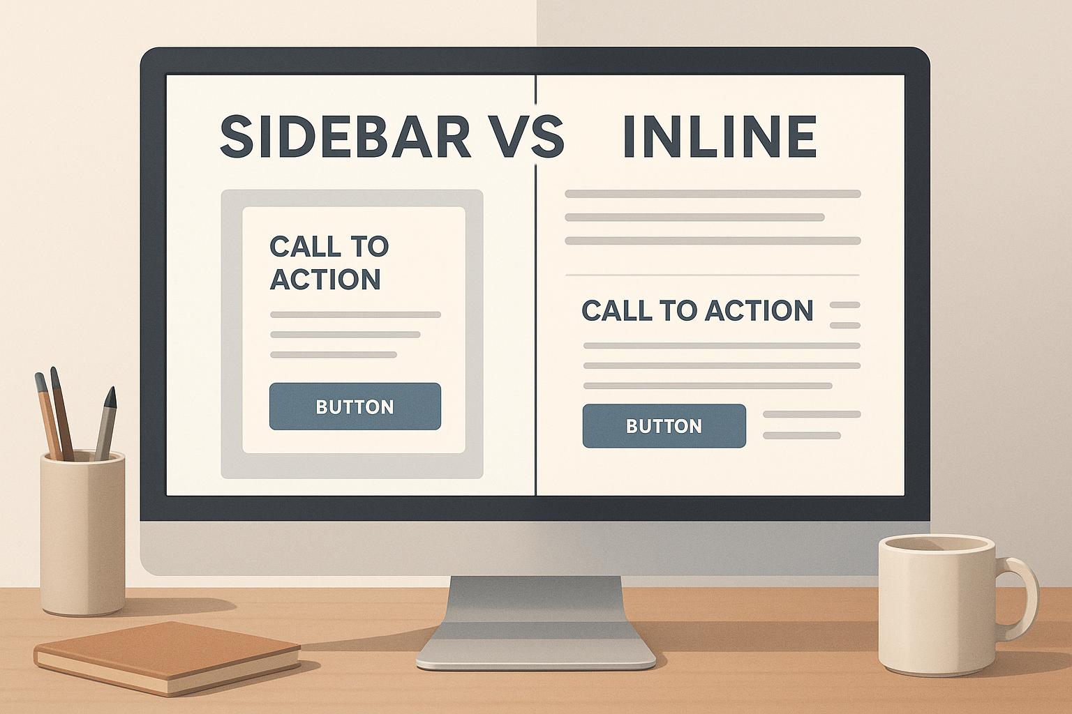
Sidebar vs Inline CTAs: Key Differences
Jul 3, 2025
Explore the differences between sidebar and inline CTAs, their effectiveness, and how to strategically use both for better engagement and conversions.

5 Types of Behavioral Triggers in Marketing
Jul 5, 2025
Explore the five key types of behavioral triggers in marketing that enhance customer engagement and drive conversions through personalized experiences.

Top 9 Tools for Measuring Twitter ROI
Jun 30, 2025
Explore the top tools for measuring Twitter ROI, enhancing your social media strategy with actionable insights and performance analytics.

How To Collect Feedback For Content Strategy
Jul 9, 2025
Learn effective strategies to gather and leverage audience feedback for enhancing your content strategy and boosting engagement.

5 Steps to Align Brand Values with Storytelling
Jul 2, 2025
Learn how to connect with customers by aligning your brand values with storytelling through five actionable steps.

7 Steps To Build A Startup Brand Story
Jul 22, 2025
Learn how to craft a compelling brand story for your startup that resonates with audiences and drives loyalty through authentic connections.

7 Tips for Writing Mobile-Friendly Emails
Jul 21, 2025
Learn how to craft mobile-friendly emails that boost engagement and avoid losing readers with practical design and formatting tips.

How to Scale Google Ads with Dynamic Remarketing
Jul 7, 2025
Learn how to effectively scale your Google Ads with dynamic remarketing to improve engagement and boost conversion rates.

Ultimate Guide to YouTube Tags and Keywords
Jun 25, 2025
Learn how to optimize your YouTube videos with effective tags and keywords to boost visibility and reach your target audience.

Scroll Depth Tracking: Setup Guide
Jul 1, 2025
Learn how to set up scroll depth tracking to enhance user engagement insights and improve your website's performance.

5 Steps to Plan Joint Marketing Campaigns
Jun 23, 2025
Learn how to successfully plan joint marketing campaigns with clear goals, defined roles, and effective monitoring to achieve better results.

User Journey Mapping for Content Strategy
Jun 26, 2025
Learn how user journey mapping can enhance your content strategy by aligning with audience needs at every stage of their interaction with your brand.

Top 7 Metrics for Measuring Ad Creative Performance
Jul 4, 2025
Learn the essential metrics for measuring ad creative performance and optimizing your marketing campaigns effectively.

10 CTA Placement Tips for Above-the-Fold Design
Jun 21, 2025
Optimize your website's CTAs with strategic placements, clear messaging, and mobile-friendly designs to boost conversions and user engagement.

What Is Email Bounce Rate And Why It Matters
Jun 29, 2025
Understanding email bounce rates is crucial for effective email marketing; high rates can damage your sender reputation and reduce engagement.

What Are Page Views and How to Track Them
Jul 6, 2025
Understanding page views is essential for improving website engagement and revenue. Learn how to track and analyze this key metric effectively.