Digital Marketing
Jul 21, 2025
Learn how to craft mobile-friendly emails that boost engagement and avoid losing readers with practical design and formatting tips.

81% of emails are opened on mobile devices, yet many businesses still design emails for desktops. This mismatch can cost you nearly half your audience, as 70% of users delete poorly displayed emails within 3 seconds. The good news? Mobile-friendly emails can boost open rates by up to 24% and click-through rates by 15%.
Here’s how to ensure your emails work perfectly on mobile:
Keep subject lines short (under 40 characters) and write preheaders that add value.
Use a single-column layout for easy reading and scrolling.
Choose readable fonts (at least 14px for body text) and proper spacing.
Break up content into short paragraphs and clear headers.
Compress images for fast loading and balance text with visuals.
Design buttons that are large, clickable, and spaced out.
Test your email on various devices and apps to ensure consistency.
With mobile now dominating email consumption, these tips can help you avoid losing readers and improve engagement.
3 Essential Tips to Optimize Your Emails for MOBILE
1. Write Better Subject Lines and Preheaders
Your subject line and preheader are the first things readers notice when they check emails on their phones. With over 70% of people opening emails on mobile devices, these elements often decide if your email gets opened or sent straight to the trash within seconds [4]. This is the first of seven practical tips for improving mobile email performance.
Since mobile screens only display 25–40 characters for subject lines and 35–90 for preheaders [3], every word needs to grab attention.
Keep Subject Lines Short and to the Point
For mobile, aim to keep subject lines under 40 characters. This ensures they won’t get cut off and that your entire message is visible in the inbox preview [3].
Front-loading your subject line is key - put the most critical words at the beginning so your main message is clear, even if the line gets truncated. For instance, "Flash Sale: 50% Off Today Only" works better than "Don't Miss Out on Our Amazing Flash Sale Event" because the essential details appear upfront.
Use direct, action-driven words like "Save", "New", "Limited", or "Today" to create urgency and avoid unnecessary fluff. For example, instead of "We're excited to announce our latest collection", go with "New Collection: Shop Now."
Personalization can also make a big difference. A short, personalized subject like "Sarah, your order shipped" is far more engaging than a vague, lengthy alternative.
Write Preheaders That Add Value
The preheader text works alongside your subject line to encourage opens [3]. It’s the snippet of text that appears next to or below the subject in most mobile email apps, offering extra context or urgency.
The secret is to make your preheader complement - not repeat - your subject line. For example, if your subject is "Sale Ends Soon", the preheader could say "Last chance to save 30% on your favorites." Together, they create a complete, compelling message.
Stick to 40–70 characters for preheaders to ensure they display properly across mobile devices [3]. Like subject lines, front-load the key details. For instance, "Track your package and see estimated delivery" works better than a longer, less focused version.
Use preheaders to highlight benefits or urgency that didn’t fit in the subject line. For example, if your subject says "Your Weekly Update", the preheader could add, "See what's new and trending this week", giving readers a clear reason to click.
Here are a few examples:
Subject Line | Preheader | Why It Works |
|---|---|---|
"Sale Ends Soon" | "Last chance to save 30% on your favorites" | Creates urgency while specifying the benefit |
"Your Weekly Update" | "See what's new and trending this week" | Delivers timely info with personal relevance |
"Welcome to NXT Brand Up" | "Discover marketing solutions tailored for you" | Introduces the brand with a personalized, helpful touch |
Avoid mistakes like leaving preheaders blank or using generic filler text like "View this email in your browser." On mobile, every character counts, so make sure your subject line and preheader work together to boost open rates.
Next, we’ll dive into how a single-column layout can make your emails even more mobile-friendly.
2. Use Single-Column Layout
Once you've nailed your subject lines and preheaders, the next step is ensuring your email layout is mobile-friendly. Simplicity is the secret to successful mobile email design. While mobile emails tend to drive high engagement, a poorly designed layout can quickly send your message to the trash bin [6]. Single-column layouts are the go-to choice for mobile emails because they remove any guesswork. Unlike multi-column designs that often break on smaller screens, single-column layouts adjust effortlessly to any device, offering a smooth reading experience that aligns with how people naturally scroll on their phones.
With mobile now dominating as the primary reading platform - accounting for 44.7% of the share [6] - your email must look flawless on everything from an older iPhone to the latest Android tablet. Here’s how to make it work.
Stack Content Vertically
Picture your email as a vertical narrative that unfolds as users scroll. Stack elements like logos, headlines, images, text, and buttons in a clean, vertical order. This approach eliminates the need for horizontal scrolling or zooming, which are common frustrations that can drive readers away. Stick to one key message per section to keep things clear and digestible. For instance, if you're promoting a sale, dedicate one section to the discount details, another to highlight featured products, and a final section for your call-to-action. Always place the most critical information at the top of your email [10], ensuring mobile users quickly understand your main message.
Design for Mobile Screen Sizes
When designing for mobile, aim for screen widths between 320px and 480px [8]. A maximum container width of about 600px [5] is a good starting point - it ensures your email looks great on desktops while staying functional on mobile. Within this container, arrange your content - images, text, and buttons - to span the full width and stack vertically [5].
Optimized mobile emails can boost unique mobile clicks by 15% [9], proving that a well-thought-out design directly influences engagement. Test your layout on common screen sizes like 320px and 375px to ensure it holds up without breaking or making text hard to read.
Finally, don’t overlook touch-friendly design. Buttons and links should be at least 44x44px to make tapping easy and frustration-free [7].
3. Choose Readable Fonts and Spacing
Even the most visually appealing email layout can fall flat if the text is hard to read. When it comes to mobile email design, typography and spacing are non-negotiable. With 71.5% of consumers primarily using their mobile phones to check emails [14], ensuring readability isn’t just a nice-to-have - it’s essential for the success of your campaign.
Poor font choices and cramped layouts make readers work harder than they should. Squinting, zooming, and struggling to navigate your email? These are surefire ways to lose your audience. Luckily, a few smart tweaks to your typography can make all the difference, keeping your readers engaged from start to finish.
Use Proper Font Sizes
Clarity is everything on smaller screens, and font size plays a huge role. For body text, stick to at least 14px, while headers should range between 22–28px [7]. This ensures your content is easy to read without causing eye strain.
"For mobile devices you should not be using anything lower than 16 px for most readable text." – Ben_M, Key Advisor [11]
When it comes to font styles, simplicity wins. Web-safe fonts like Arial, Helvetica, and Georgia [7] are reliable choices because they display well across various devices and email clients. Decorative or script fonts, while stylish on desktops, often become unreadable on mobile screens - so it’s best to avoid them.
Spacing matters just as much as font size. Aim for a line height roughly 1.4× your font size [7] to create breathing room for your text. For example, if your body text is 16px, a line height of about 22px works well. With 42% of people opening emails on mobile devices [7], your spacing choices directly influence engagement. Dense, cluttered text blocks can overwhelm readers. Instead, opt for shorter lines and generous white space to guide the eye smoothly through your email [7].
Add Space Around Buttons and Links
Cramped buttons and links are a common frustration for mobile users. When touch elements are too close together, users often tap the wrong thing, leading to irritation and missed opportunities. Studies show that poorly spaced buttons result in the lowest touch accuracy [12].
To avoid this, add 10–25px of padding around clickable elements. This not only ensures easier navigation but also makes buttons more visually prominent. For text links, maintain at least 12 pixels of spacing [12] to prevent accidental taps. These adjustments improve usability and make your email more functional for mobile users.
The benefits are clear: mobile-friendly email campaigns see a 15% boost in unique mobile clicks [9] when touch elements are thoughtfully designed. And don’t forget, touch targets should be at least 1cm x 1cm (0.4in x 0.4in) [13] to accommodate users with larger fingers or those quickly skimming emails on the go.
4. Format Content for Mobile Reading
When it comes to mobile, people interact with emails differently than they do on a desktop. Most mobile users skim through emails quickly [15], so your content needs to be easy to scan and understand at a glance. The trick is to structure your emails in a way that lets busy readers find what they need without feeling overwhelmed.
Break your content into smaller, manageable chunks. What looks fine as a full paragraph on a desktop can feel like a wall of text on a mobile screen. Instead, aim for a conversational flow with clear breaks that guide readers naturally through your message.
Use Short Paragraphs and Clear Headers
Formatting plays a huge role in making your content mobile-friendly. Keep paragraphs short - just 2-3 sentences max [15]. Long text blocks can feel intimidating and might push readers to abandon your email entirely.
Headers and bold text are your allies here. They create a visual structure that guides the eye [15] [16], making the email easier to navigate. Think of headers as signposts, helping readers quickly locate the information they care about most.
Position your key points - like offers, important details, or calls to action - right at the top [15]. Don’t bury the good stuff halfway down the email. Start strong with an attention-grabbing statement or question [15], then move from broad, essential information to more specific details. This mirrors the way people naturally skim content on their phones.
Compress Images for Fast Loading
Slow-loading images are a surefire way to lose your audience. Mobile devices and connections can often be slower [18], so optimizing your images is essential. Large image files not only frustrate users but can also cause emails to bounce back if they exceed size limits [17].
The solution? Compress your images. Resize them to widths between 320px and 720px for most mobile screens [18]. This keeps them looking sharp without overloading devices or draining data plans.
"Great mobile user experience starts with speed. This is your first impression for a prospective customer and signals not just about the quality of the experience of the web page - it's also the quality of your brand and product." - Adrienne Clem, Director of Search Ads Growth and Optimization at Google [18]
Optimized images can have a big impact. Shopify found that speeding up mobile sites led to users spending more time on the page and a 20% boost in conversions [18]. While this applies to websites, the same principle holds true for email campaigns.
For best results, use stronger compression for JPEGs and lighter compression for PNGs and GIFs [17]. Removing EXIF data can further reduce file sizes [17]. Keeping your email size under 100KB also helps it pass through spam filters and land in inboxes [17].
Compression Type | Best Use Case | Quality Impact |
|---|---|---|
Lossy | Colorful photos and detailed visuals | Slight quality drop for big size savings |
Glossy | Professional images needing balance | Moderate size cut with minimal quality loss |
Lossless | Line art and text-heavy visuals | No quality loss, smaller size reduction |
By compressing images strategically, you’ll maintain both speed and visual appeal.
Balance Text and Images
Striking the right balance between text and visuals is key to creating effective mobile emails. Too much text can overwhelm readers, while too many images can slow down loading times and even trigger spam filters. The goal is to create a layout where text and visuals work together to enhance your message.
Image compression plays a big role here. It reduces file sizes without noticeably affecting quality [18]. Consider using formats like WebP and AVIF, which offer better compression than traditional JPEGs or PNGs [18].
If you need to include multiple images, think about bundling them into a ZIP file instead of embedding them individually [17]. This can be a more efficient way to share product catalogs or photo galleries.
Every visual element should have a purpose - whether it’s highlighting a product, illustrating an idea, or breaking up text. Avoid decorative images that don’t add value to your message.
Remember, mobile screens are small, and every pixel matters. Make sure your text-to-image ratio supports your main message rather than competing with it. When done right, this balance creates emails that are both visually appealing and highly functional for mobile readers.
These formatting tips, combined with earlier layout and font choices, will help you deliver a seamless mobile email experience.
5. Make Buttons and Links Easy to Tap
When it comes to mobile design, buttons and links play a huge role in creating a smooth user experience. Ever tried tapping a tiny button on your phone and ended up hitting the wrong link? Frustrating, right? Small, hard-to-tap buttons can drive users away quickly. To keep them engaged, you need touch-friendly elements that work well on smaller screens.
Create Large, Clickable Buttons
The size of your buttons can make or break the mobile experience. Ideally, buttons should measure between 44x44 and 72x72 pixels, with 60x60 pixels being the sweet spot. Also, leave 12–48 pixels of spacing between buttons to prevent accidental taps [7][12]. Research shows that buttons smaller than 42 pixels or larger than 72 pixels can reduce touch accuracy, while 60 pixels strikes the right balance for most users [12].
For users on the go - like someone checking their phone while walking or commuting - slightly larger buttons can make tapping easier and improve overall usability [13].
Link to Mobile-Friendly Pages
Big, tappable buttons are only part of the equation. Where those buttons lead is just as important. If your links take users to slow or poorly designed pages, all your button optimization efforts go to waste. Every link should lead to fast, mobile-optimized pages that match the expectations of mobile users.
Use clear, action-oriented text on buttons, like "Sign Up Now" or "Learn More", to guide users effectively. And don’t forget about URL structure - make it simple and clean for a seamless journey [19].
Mobile users demand speed and simplicity [19]. A clunky landing page can undo all the good work you’ve done in your email design. Plus, Google might penalize sites that aren’t mobile-friendly, which could hurt your search rankings [19].
"Mobile optimization is no longer optional - it's essential. A well-optimized landing page creates a seamless experience for users and helps your business grow." – Jacob Tyler [19]
Finally, make sure your meta tags and descriptions highlight the value users will get when they click through. Adding mobile-specific keywords can also help boost your search visibility [19]. The ultimate goal? A smooth, uninterrupted path from your email to the action you want users to take.
6. Test on Different Devices and Email Apps
Once your mobile-friendly design is polished, the next step is thorough testing. With over 71.5% of consumers primarily checking email on mobile devices and more than 72% using Gmail accounts [21], testing across various platforms and devices isn't optional - it's essential.
Different email clients interpret HTML and CSS in their own ways, which can lead to inconsistent displays. An email that looks flawless on an iPhone might appear broken on an Android device, and what works in Gmail might fail in Outlook [21]. Since email clients update approximately every 1.2 days [23], regular testing is crucial to ensure your design holds up in real-world scenarios.
"Email rendering across multiple email clients is a constant challenge for businesses. With a multitude of email clients and devices in use today, senders must navigate the intricacies of HTML and CSS compatibility, responsive design, and rendering inconsistencies to ensure emails are received and displayed correctly across all platforms. Email preview tools can help overcome these challenges by testing emails before they are sent to avoid broken elements that can harm brand image, downgrade user experience, and impact engagement and conversions." – Kate Nowrouzi, VP of Deliverability, Sinch Mailgun [22]
Testing helps identify issues like broken layouts, missing images, or formatting errors before your recipients encounter them [20]. It also improves deliverability since properly rendered emails are less likely to be flagged as spam [22].
Test on iOS and Android
The two dominant mobile operating systems - iOS and Android - handle emails differently, so testing on both is critical. Use your analytics to identify the most commonly used devices among your audience and focus your efforts there [24]. This targeted approach ensures your emails perform well for your key segments without wasting time.
For example, a marketing email might look perfect on iOS but fail to scale images correctly on smaller Android screens. In such cases, adjustments to the email's media queries may be necessary to ensure compatibility across all Android devices [20]. Cross-platform testing helps catch these issues before they impact your audience.
Don’t limit your testing to the latest devices. Many users still rely on older models, and an email that performs well on a new iPhone might struggle on a three-year-old Android phone with limited processing power [24]. Testing on a variety of devices ensures your email performs consistently across your entire audience.
Check All Links and Formatting
After ensuring your email is touch-friendly, verify that every link and style works as intended. Check that all links lead to mobile-optimized pages and test every button and link on different devices. With nearly 25% of consumers viewing emails in dark mode [21], it's also important to test your formatting in both light and dark themes.
For instance, during a campaign test, designers discovered that some CSS styles weren't supported in older versions of Outlook, causing the layout to break completely. They resolved this by adding fallback styles specifically for Outlook [20]. Without proper testing, such issues could harm your brand’s professional image.
Pay close attention to how images load, how fonts render, and how spacing appears across different email clients. For example, what looks perfectly spaced in Apple Mail might appear cramped in Gmail. Testing on real devices is the best way to capture the true user experience.
The bottom line? Testing isn’t a one-and-done process. As email clients update and new devices hit the market, your testing strategy should evolve. Make continuous testing a regular part of your email workflow [24].
Conclusion
Mobile-friendly email design is no longer optional - it's a must for anyone looking to succeed in today's digital landscape. With 81% of emails now being opened on mobile devices instead of desktops [1], ensuring your emails are optimized for smaller screens is critical.
The strategies we've discussed work together to create a smooth and engaging mobile experience. Crafting better subject lines and preheaders is key, especially since nearly half (47%) of email recipients decide to open an email based on the subject line alone [2]. Using single-column layouts, readable fonts, and clear formatting ensures your content looks great and functions well on mobile devices. Add in easy-to-tap buttons, and you're guiding readers toward taking action effortlessly. And don't forget - testing across devices ensures your emails perform consistently, no matter where they're viewed.
The benefits of these practices are hard to ignore. Responsive mobile emails can increase mobile clicks by about 15% [25]. Plus, mobile users check their emails three times more often than those on desktops [1]. When done right, mobile-friendly emails can deliver a return of $36 to $38 for every dollar spent [28], making it a smart move for businesses of all sizes.
For small businesses and entrepreneurs, the stakes are even higher. A poor mobile experience can turn off 52% of customers [1], and 40% of users will abandon emails that take longer than three seconds to load [26]. By prioritizing mobile optimization, you not only protect your revenue but also build stronger relationships with your audience.
"Responsive design is no longer a luxury, but a necessity." – InVision [27]
If you're ready to take your email marketing to the next level, partnering with experts can make all the difference. NXT Brand Up offers a full range of digital marketing services, including email marketing optimization, SEO, social media management, and web development. Their team specializes in creating targeted email campaigns, optimizing content for mobile, and tracking key metrics like open rates and click-through rates. With customizable packages starting at $1,499 per month, NXT Brand Up provides end-to-end solutions designed to maximize ROI across all platforms.
FAQs
How can I make sure my email design looks great on all mobile devices and apps?
To make sure your email design looks great on all kinds of mobile devices and email apps, prioritize responsive design techniques. These techniques ensure your emails adapt smoothly to different screen sizes. It's also important to test your emails on a variety of devices and platforms to spot any potential issues. For added assurance, leverage email testing tools to preview how your emails will display across different email clients. These steps help guarantee a seamless and consistent experience for your audience.
How can I compress images for mobile emails without losing quality?
To make images mobile-friendly for emails, aim to compress them to under 200 KB while keeping the quality intact. Resize the images to a width of 600–1,000 pixels and set the resolution to 72 DPI for optimal display. Opt for efficient formats like JPEG or WebP, which are great for compression without sacrificing clarity. Tools such as TinyPNG or Compressor.io are excellent for reducing file sizes without a visible drop in quality. Keeping images lightweight not only speeds up loading times but also enhances the overall experience for mobile users.
Why should you test your emails in both light and dark modes, and how can you do it effectively?
Why Testing Emails in Light and Dark Modes Matters
Testing your emails in both light and dark modes is essential to make sure your message is easy to read, visually appealing, and works seamlessly across various devices and email clients. With more users opting for dark mode, skipping this step could mean your email ends up looking messy or hard to read.
To get it right, preview your emails on different devices and email platforms, checking both light and dark modes. Pay close attention to how text stands out, how background colors look, and whether images display correctly. This way, you can fix any problems before hitting send, ensuring every recipient has a polished and consistent experience.
Related posts
Related Articles

7 Social Media Marketing Tips for Small Business Growth
May 21, 2025
Unlock growth for your small business with essential social media marketing strategies that connect, engage, and drive results.

How to Create Engaging Podcast Content: A Beginner's Guide
May 22, 2025
Learn how to create engaging podcasts by understanding your audience, structuring episodes, ensuring audio quality, and promoting effectively.

SEO vs PPC: Which Digital Marketing Strategy Fits Your Budget
May 23, 2025
Explore the differences between SEO and PPC to find the best digital marketing strategy for your budget, timeline, and industry needs.

Local SEO Checklist: 10 Steps to Improve Rankings
May 25, 2025
Enhance your local SEO with practical steps to boost visibility, attract nearby customers, and improve search rankings effectively.

Digital Marketing Budget Guide for Small Businesses
May 26, 2025
Learn how to effectively budget for digital marketing in small businesses to maximize ROI and adapt to changing market conditions.

5 Ways Short-Form Video Can Boost Your Business ROI
May 24, 2025
Short-form videos can significantly enhance your business ROI by boosting engagement, saving costs, and driving sales effectively.

How to Choose the Right Marketing Agency: 6 Key Factors
May 28, 2025
Choosing the right marketing agency is crucial for business success. Explore key factors to find the perfect match for your goals.

Content Marketing vs Social Media: What to Prioritize
May 27, 2025
Learn how to balance content marketing and social media for effective growth and engagement, tailored to your business goals and resources.

8 Interactive Storytelling Techniques for Brands
Jun 1, 2025
Explore interactive storytelling techniques that boost audience engagement and enhance brand connections through innovative experiences.

Unified Brand Messaging: Why It Matters
May 31, 2025
Explore the importance of unified brand messaging in building trust, enhancing engagement, and driving revenue for your business.

How Case Studies Build Trust Through Storytelling
May 29, 2025
Learn how case studies build trust through relatable storytelling, real data, and emotional connections with potential customers.

Ultimate Guide to Email Send Time Optimization
Jun 2, 2025
Learn how to optimize email send times for better engagement and increased ROI through audience segmentation and A/B testing strategies.

10 Real-Time Social Media Engagement Tips
May 30, 2025
Unlock effective social media strategies with real-time engagement tips that boost brand visibility and foster customer loyalty.

What Is Email Blacklist Status?
Jun 3, 2025
Learn how blacklisting affects email deliverability and discover strategies to prevent and resolve blacklist issues for better business communication.

Behavioral Trigger Campaigns: Step-by-Step Setup
Jun 4, 2025
Learn how to set up effective behavioral trigger campaigns to enhance customer engagement and boost conversions through personalized messaging.

10 Data-Driven Lead Generation Strategies
Jun 9, 2025
Explore 10 data-driven lead generation strategies that enhance targeting, boost conversions, and improve ROI for your business.

How SEO Drives Marketing ROI
Jun 7, 2025
Explore how SEO enhances visibility, drives qualified traffic, and boosts conversions, ultimately delivering substantial marketing ROI.

Organic vs Paid Social Media: Key Differences
Jun 6, 2025
Explore the essential differences between organic and paid social media strategies to effectively grow your brand and engage your audience.

10 Tips for Writing Spam-Free Subject Lines
Jun 5, 2025
Learn essential tips for crafting effective email subject lines that avoid spam filters and boost open rates to enhance your email marketing success.

Podcast Distribution Checklist for Beginners
Jun 8, 2025
Learn the essential steps for distributing your podcast effectively to maximize reach and attract more listeners across various platforms.
7 CTA Placement Tips for E-Commerce Pages
Jun 24, 2025
Effective CTA placement can significantly boost e-commerce conversions. Learn strategic tips to enhance user engagement and sales.

Top Metrics for Measuring Cross-Channel Campaign Success
Jun 28, 2025
Explore essential metrics for cross-channel campaign success to optimize marketing strategies and enhance customer engagement effectively.

5 Podcast Paywall Models Explained
Jun 27, 2025
Explore five podcast paywall models that help creators monetize effectively while balancing audience engagement and revenue.

What Is Needs-Based Segmentation?
Jul 8, 2025
Explore how needs-based segmentation enhances customer engagement through personalized marketing strategies that address specific motivations and challenges.

Inclusive Marketing vs. Tokenism
Jul 10, 2025
Explore the critical differences between inclusive marketing and tokenism, and learn how genuine diversity can drive brand loyalty and business growth.
Sidebar vs Inline CTAs: Key Differences
Jul 3, 2025
Explore the differences between sidebar and inline CTAs, their effectiveness, and how to strategically use both for better engagement and conversions.

5 Types of Behavioral Triggers in Marketing
Jul 5, 2025
Explore the five key types of behavioral triggers in marketing that enhance customer engagement and drive conversions through personalized experiences.

Top 9 Tools for Measuring Twitter ROI
Jun 30, 2025
Explore the top tools for measuring Twitter ROI, enhancing your social media strategy with actionable insights and performance analytics.

How To Collect Feedback For Content Strategy
Jul 9, 2025
Learn effective strategies to gather and leverage audience feedback for enhancing your content strategy and boosting engagement.
Mobile-First Design: 7 Key Principles
Jun 22, 2025
Learn essential mobile-first design principles to enhance user experience, boost performance, and ensure accessibility across all devices.

5 Steps to Align Brand Values with Storytelling
Jul 2, 2025
Learn how to connect with customers by aligning your brand values with storytelling through five actionable steps.

7 Steps To Build A Startup Brand Story
Jul 22, 2025
Learn how to craft a compelling brand story for your startup that resonates with audiences and drives loyalty through authentic connections.

How to Scale Google Ads with Dynamic Remarketing
Jul 7, 2025
Learn how to effectively scale your Google Ads with dynamic remarketing to improve engagement and boost conversion rates.

Ultimate Guide to YouTube Tags and Keywords
Jun 25, 2025
Learn how to optimize your YouTube videos with effective tags and keywords to boost visibility and reach your target audience.
Scroll Depth Tracking: Setup Guide
Jul 1, 2025
Learn how to set up scroll depth tracking to enhance user engagement insights and improve your website's performance.

5 Steps to Plan Joint Marketing Campaigns
Jun 23, 2025
Learn how to successfully plan joint marketing campaigns with clear goals, defined roles, and effective monitoring to achieve better results.

User Journey Mapping for Content Strategy
Jun 26, 2025
Learn how user journey mapping can enhance your content strategy by aligning with audience needs at every stage of their interaction with your brand.

Top 7 Metrics for Measuring Ad Creative Performance
Jul 4, 2025
Learn the essential metrics for measuring ad creative performance and optimizing your marketing campaigns effectively.
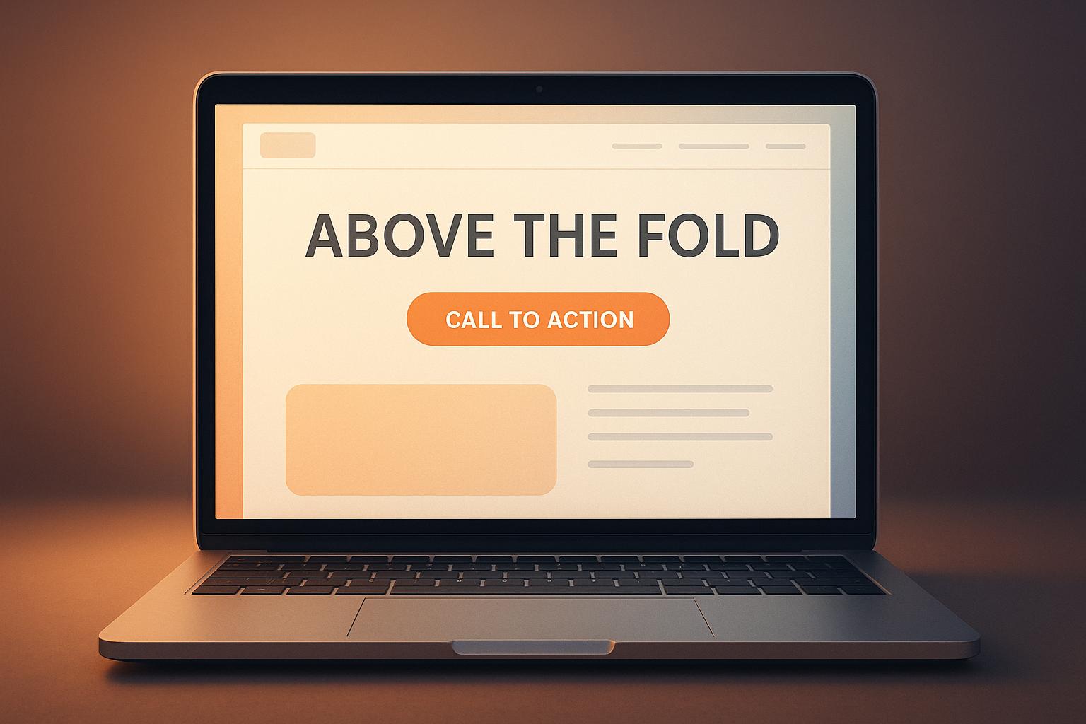
10 CTA Placement Tips for Above-the-Fold Design
Jun 21, 2025
Optimize your website's CTAs with strategic placements, clear messaging, and mobile-friendly designs to boost conversions and user engagement.

What Is Email Bounce Rate And Why It Matters
Jun 29, 2025
Understanding email bounce rates is crucial for effective email marketing; high rates can damage your sender reputation and reduce engagement.

What Are Page Views and How to Track Them
Jul 6, 2025
Understanding page views is essential for improving website engagement and revenue. Learn how to track and analyze this key metric effectively.