Digital Marketing
Jun 21, 2025
Optimize your website's CTAs with strategic placements, clear messaging, and mobile-friendly designs to boost conversions and user engagement.

Want more clicks on your website? Start with your CTAs (Call-to-Actions).
Here’s the deal: 57% of user attention stays above the fold, and CTAs in this area have a 91% chance of being seen. But not all CTAs work equally well. To boost conversions, you need clear messaging, smart placement, and mobile-friendly design.
Key Takeaways:
Use clear, action-focused text: Examples like "Start Free Trial" or "Download Now" outperform vague phrases like "Click Here."
Place CTAs where users look first: Near headlines, hero sections, or navigation menus.
Make CTAs stand out visually: Use high-contrast colors, readable fonts, and plenty of white space.
Optimize for mobile: Test button sizes, placement, and visibility across devices.
Test and refine: A/B test different designs, colors, and placements to find what works best.
Quick Tip: Don’t overwhelm visitors. Stick to one main CTA per section, and make it easy to act.
Want more details? Let’s break it down step by step.
Positioning your CTA above the fold
1. Write Clear and Direct CTA Text
A well-crafted call-to-action (CTA) turns curiosity into action. When someone lands on your page, they should immediately understand what happens when they click your button. Phrases like "Click Here" or "Learn More" are too vague and can leave visitors unsure, which often leads to fewer conversions.
Clarity of Messaging
The key to effective CTAs is action-oriented language. Use strong, direct verbs to guide users: "Start Your Free Trial", "Download the Guide", or "Book a Demo." These phrases eliminate guesswork and clearly outline the next step.
Tailor your CTA to match the visitor’s intent. For those exploring options, "Get Started" works well. For buyers ready to commit, "Buy Now" is more appropriate.
Keep your CTA brief - ideally 2-5 words. Shorter phrases pack more punch. For example, "Subscribe Free" communicates faster and more effectively than "Subscribe to Our Free Newsletter Today."
This concise, action-driven messaging lays the foundation for the visual design elements discussed next.
Visual Design and Contrast
Design plays a huge role in making your CTA stand out. Use high-contrast colors and plenty of space to ensure the text is easy to read and tap. For instance, dark text on light buttons or white text on bold backgrounds works well across devices and lighting conditions. The text should pop against the button color and surrounding page elements.
Stick to clean, easy-to-read fonts - avoid overly decorative styles. Adding bold weights to the text can increase visibility without needing oversized fonts.
These design choices ensure your CTAs remain effective, no matter the platform, as we’ll explore in the next section on responsiveness.
Adaptability for Responsiveness
On mobile, clarity is even more critical. Test how your CTA text looks across different screen sizes. For example, you might shorten "Start Your Free 30-Day Trial" to "Start Free Trial" on smaller screens to maintain readability and impact.
Also, ensure buttons meet the recommended touch target size of at least 44 pixels. This approach helps with both usability and accessibility, making sure the text remains easy to read and the button easy to tap.
These strategies work hand-in-hand with placing CTAs above the fold, ensuring they grab attention and drive action immediately.
For businesses aiming to improve their CTA design and placement for better conversions, NXT Brand Up offers expert web design and digital advertising services to fine-tune these crucial elements for maximum results.
2. Place CTAs Where Users Look First
To make your call-to-action (CTA) effective, it needs to be exactly where users naturally focus their attention. Studies show that people form an opinion about a website within seconds, so placing CTAs strategically is critical.
Positioning and Visibility
The placement of your CTA plays a massive role in grabbing attention. Research reveals that the area above the fold - the section of a webpage visible without scrolling - captures 57% of users' viewing time. This makes it a prime spot for your most important CTAs. In fact, the top 100 pixels above the fold are viewed 102% more often than content below, and CTAs in this area have a 73% visibility rate, compared to just 44% below the fold [3][6].
Additionally, 66% of leads come from CTAs placed at the top of the page, and CTAs above the fold have a 91% chance of being seen [8]. Ideal spots include near the headline, beside navigation menus, or within the hero section. These areas align with natural eye-scanning patterns, ensuring your CTA is front and center.
Visual Design and Contrast
Once you've nailed the placement, the design of your CTA needs to grab attention without overwhelming the page. Contrasting colors that complement your site's theme help your CTA stand out. For example, Evernote uses a bold green button on its homepage to encourage sign-ups, while Huemor opts for a bright pink button that pops against a light green background [9][10].
White space is just as important - it keeps your CTA from getting lost in the clutter. A clean, uncluttered design draws the eye naturally to the button. Make sure the button is large enough to notice but not so big that it disrupts the overall design. Think of it as creating a visual hierarchy that guides users to take action.
"Above the fold is where users form their first impressions and where a call-to-action can have the most impact." - Perion Staff [7]
Adaptability for Responsiveness
Your CTA strategy shouldn't stop at desktop design. Placement needs to adapt to different devices to ensure visibility. On desktop, a CTA might work well in the top-right corner of the header. On mobile, however, centering the CTA below the headline ensures it's easy to see and tap.
Always test your CTA placement across devices. What looks great above the fold on a desktop could shift out of view on a mobile screen, reducing its effectiveness. To cover all bases, consider using multiple CTAs: one above the fold for immediate attention and others naturally integrated within your content for users who scroll [5].
The goal is simple: keep your CTA visible during those crucial first moments of a user’s visit, no matter what device they’re using.
3. Make CTAs Work on All Screen Sizes
Once you’ve nailed down clear messaging and strategic placement for desktop, the next step is ensuring your CTAs function smoothly across all devices. With mobile devices accounting for 53.42% of global website traffic in the second quarter of 2022, a mobile-first approach is no longer optional - it’s essential. But don’t forget about desktop users; they’re still a key part of your audience [17].
The goal is to make your CTAs adaptable, ensuring they look and work great on any screen size.
Positioning and Visibility
Did you know mobile users spend 57% of their browsing time at the top of the page [8]? That means your most important CTAs should be placed where they’re easy to spot - ideally in the center of the screen for maximum visibility.
For mobile, consider the "thumb zone", which is the lower half of the screen where users naturally interact with their thumbs. Placing CTAs in this area makes them more accessible while still keeping them visible above the fold. Keep in mind that what works on desktop might need tweaking for mobile. A CTA perfectly placed on a large screen could feel awkward or inaccessible on a smaller one.
Adaptability for Responsiveness
Responsive design is the backbone of a seamless user experience. Your CTAs should adjust effortlessly across mobile, tablet, and desktop without sacrificing functionality or aesthetics. Use responsive grids and relative font sizes so your buttons scale naturally with different screen dimensions [15].
Media queries are your best friend here. They help your layout adapt at common breakpoints, but don’t stop there - test extensively. For instance, a CTA that looks great at 768px might break at 800px if not properly configured [12]. Avoid fixed heights for CTA containers unless absolutely necessary, as they can cause issues across varying devices.
And let’s not forget touch interaction. Button size matters - a lot. Apple recommends a minimum size of 44px by 44px, Google suggests 48px by 48px, and WCAG guidelines also align with 44px by 44px [11]. These aren’t arbitrary numbers; the average adult finger pad is about 10mm wide, so smaller buttons can lead to frustrating mis-taps [13]. One shopping app saw a 20% drop in abandoned carts simply by increasing their checkout button to meet these sizing standards [13].
Once your CTAs are functional, focus on keeping the design clean and intuitive across all devices.
Visual Design and Contrast
A strong visual hierarchy is crucial, especially when designing for smaller screens. High contrast between text and background improves readability, which is vital for users viewing your site in different lighting conditions [15]. Choose CTA colors that stand out from the rest of the page, and make sure they look consistent across various screen types.
On mobile, spacing is even more critical. Use enough white space to separate CTAs from other elements, reducing the risk of accidental taps. While hover states can enhance the desktop experience, remember that touch devices don’t support them - so focus on designs that look appealing without this feature [16].
Testing and Real Device Considerations
Testing isn’t just a box to check - it’s a must. Tools like BrowserStack can help you test your UI across a variety of browser and device combinations [12]. But don’t rely solely on simulations; real device testing often uncovers problems that tools miss.
Here’s why this matters: 8 out of 10 visitors will abandon a site that doesn’t display properly on their device [14]. Even the most carefully crafted CTA won’t drive conversions if it doesn’t function seamlessly on every screen. By prioritizing responsive design and thorough testing, you ensure your users have a smooth experience - no matter how they access your site.
4. Use Visual Hierarchy to Make CTAs Stand Out
Building on responsive design and smart placement, creating a clear visual hierarchy is another way to boost engagement with your CTAs. By leveraging contrast, color, and positioning, you can guide your audience’s attention exactly where you want it.
Visual Design and Contrast
Color plays a huge role in catching the eye. In fact, a survey of 500 consumers found that 39% consider color the most important visual element on a website [19]. People form snap judgments based on color, so it’s worth getting it right.
Contrast is key here. Take HubSpot’s 2011 experiment, for example. They discovered that red buttons outperformed green ones, increasing clicks by 21%. Why? Because green dominated the page, and the red button stood out against it [19].
To make your CTAs pop, use complementary colors. If your background is light, bold shades like orange or green can grab attention. And don’t forget the psychology behind colors:
Red suggests urgency, perfect for time-sensitive actions.
Blue conveys trust and security, ideal for CTAs like "Learn More."
Green feels calming, making it a great choice for "Sign Up" or similar prompts [4].
As Elwyn Davies from Pixelhaze Academy puts it:
"Color is a silent salesman; its psychological impact can significantly influence user actions. Choosing the right color for your CTA can mean the difference between a user clicking through or moving on." [20]
Positioning and Visibility
Where you place your CTA matters just as much as how it looks. Surrounding it with plenty of white space helps it stand out without competing with other elements. A larger button size for your primary CTA also establishes its importance over secondary links or buttons.
Make sure your CTA text is clear and concise - visitors should instantly understand what action you’re asking them to take. Keeping it above the fold and easy to spot ensures maximum visibility.
Finally, don’t be afraid to experiment. A/B testing different color combinations, button sizes, and contrast levels can fine-tune your design and help you create CTAs that convert effectively.
5. Remove Distractions Around CTAs
After establishing a strong visual hierarchy, the next step is to declutter the area around your CTAs (Call-to-Actions). With users forming an opinion about a website in just 2.6 seconds and spending 57% of their viewing time above the fold [1], any unnecessary elements competing for attention can negatively impact your conversion rates.
Keep Your Messaging Clear
Simplify the content surrounding your CTA to avoid overwhelming users. Too many competing messages can dilute the primary action you want visitors to take, leading to lower conversions [23].
Take Freedom, an app and website blocker, as an example. Their above-the-fold design is a masterclass in clarity. It features clean, straightforward messaging paired with a clear "sign up for free" CTA. This setup immediately communicates their value without unnecessary distractions [26].
Additionally, consider the space and placement of your CTA to naturally draw attention.
Optimize Positioning and Visibility
Once you've nailed the messaging, focus on positioning your CTA in a way that maximizes its impact. Surround it with ample white space to make it pop and avoid clutter. Placing your primary CTA near a strong headline or hero image can also help it stand out [25].
Kombu’s product page illustrates this perfectly. Their "add to cart" button is displayed on a high-contrast background, making it easy to spot. They keep the design minimal, with a simple "Scroll" prompt that encourages users to explore further without distracting from the main action [2].
For more complex offers, you might want to delay introducing secondary CTAs until users have scrolled further and gained more context. This prevents overwhelming new visitors while still offering additional options for those who are ready to engage.
Use Contrast and Visual Design Strategically
With clear messaging and thoughtful placement, the next step is to minimize visual clutter around your CTA. White space plays a critical role here, improving readability and drawing attention to key elements [25]. For accessibility and better conversions, ensure your design meets contrast standards. The World Wide Web Consortium recommends a minimum contrast ratio of 4.5:1 for normal text and 3:1 for larger text [27].
Contrast isn’t just about accessibility - it also boosts engagement. High-contrast visuals are more memorable, and a bold "Buy Now" button is more likely to attract clicks [27]. You can achieve this through complementary colors, brightness tweaks, or saturation adjustments, even if you stick to the same color palette.
Smile Direct Club sets a great example. Their above-the-fold banner prominently displays pricing details alongside a product image, an award logo, and two distinct CTAs ("Am I a Candidate?"). The design balances these elements with clear contrast, ensuring they don’t compete for attention [2].
Make It Work on Every Device
On smaller screens, where space is limited, removing distractions becomes even more crucial. Test your CTA on various devices to ensure it remains prominent and effective.
A clean, focused design with relevant CTAs and minimal distractions encourages visitors to engage further [24]. Prioritize simplicity, leverage white space, and avoid unnecessary elements to ensure your CTA stands out - no matter how users access your site [25].
6. Add Supporting Images Near CTAs
Adding supporting images near your CTAs can significantly boost their effectiveness. Studies reveal that users generally read just 20% of the text on a page [32], making visuals a powerful tool for quickly conveying your message.
Clarity of Messaging
High-quality visuals can instantly communicate your message [28]. They work best when they complement your headline and CTA rather than compete for attention [1]. The purpose of these visuals is to provide context and encourage users to click on your CTA.
For example, a compelling hero image can reinforce your headline while helping visitors quickly grasp the purpose of your website [1]. To make the most impact, ensure the visuals align with your service and evoke an emotional response [1].
This combination of strong visuals and clear messaging sets the stage for strategic placement, which we'll cover next.
Positioning and Visibility
Where you place supporting images in relation to your CTA can greatly affect user engagement. Positioning buttons near contrasting elements or images that naturally draw attention to them is a smart move. Product shots or customer photos placed next to CTAs can boost both visibility and trust [30].
These images do more than just decorate the page - they build credibility, reduce hesitation, and provide visual cues that nudge users toward taking action. For instance, seeing a happy customer or a clear product image near the CTA can make users feel more confident about clicking through.
Visual Design and Contrast
Once your messaging is clear, your visuals should guide the user's focus. Strong contrast between images and CTAs not only enhances visual appeal but also improves accessibility. In fact, higher contrast designs can lead to a 23% increase in conversion rates [32].
You can create contrast by adjusting brightness, darkening parts of an image to highlight key elements, using contrasting colors, or pairing smaller design elements with larger ones [31]. The goal is to make your CTA pop while keeping the overall design cohesive.
Element Type | Recommended Contrast Ratio | Impact on Performance |
|---|---|---|
Normal Text | 4.5:1 | Better readability and less user frustration |
Large Text | 3:1 | Enhanced visual accessibility |
CTA Buttons | Higher than 3:1 | Higher click-through rates and improved results |
Adaptability for Responsiveness
Your supporting images need to look great and function effectively across all devices. Optimize visuals for fast loading times, as slow-loading images can frustrate users and hurt conversions [29].
Keep the visuals simple and uncluttered [1]. On mobile devices, where space is limited, images should enhance the CTA without overwhelming the screen. Test how your image-CTA combinations perform on various screen sizes to ensure they remain effective.
Use high-quality visuals - whether photos, videos, or graphics - that resonate with your audience and reflect your brand [29]. Since people are naturally drawn to visuals [28], the right supporting image can make all the difference between a user scrolling past your CTA or clicking on it.
Next, we'll dive into how focused design can further drive conversions.
7. Focus on One Main CTA
When visitors are presented with too many choices, they often feel overwhelmed. Simplifying your page with a single, clear call-to-action (CTA) not only reduces confusion but also encourages users to take the desired next step. This approach aligns with earlier advice to minimize clutter and create a smoother user experience.
Clarity of Messaging
Your CTA should leave no room for doubt about what happens next. Using action-focused language can increase click-through rates by as much as 121% [34]. Keep it short - ideally between two and seven words [21] - and make it direct. Phrases like "Get Started" or "Sign Up Now" work well because they clearly outline the next step.
Avoid vague terms like "click here." Instead, choose verbs that describe the specific action users will take, while also creating a sense of urgency. This not only sets clear expectations but also encourages engagement. To reinforce this clarity, place your CTA in an obvious, high-visibility area where users can't miss it.
Positioning and Visibility
Your CTA should be easy to spot and positioned prominently above the fold. Placing it just below your headline or hero image works well, as these are natural focal points for visitors. Additionally, ensure there’s enough spacing around the button to make it easy to tap on all devices.
Visual Design and Contrast
For your CTA to stand out, it needs to be visually distinct while still aligning with your overall design. High-contrast elements are particularly effective, so use colors that make the button pop against its background without clashing with your branding [33]. Proper visual separation from surrounding elements ensures your CTA is immediately recognizable as the primary action you want users to take.
Responsiveness Across Devices
A single, well-designed CTA works seamlessly across all devices, reducing confusion and improving usability. Test your CTA on different screen sizes to ensure it remains prominent and functional. The button should be large enough for easy tapping on mobile devices, while still fitting proportionally within the overall layout.
"Don't cram everything above the fold. Visitors are willing to scroll… as long as they know there's something to scroll down for." - Joanna Wiebe, Copy Hackers [1]
8. Test Different CTA Versions
Building on earlier strategies like clear messaging and strategic placement, testing is the next step to fine-tune your call-to-action (CTA) performance. A/B testing different CTA versions provides data-driven insights into what works best for your audience. Instead of guessing which design or placement will yield results, testing offers clarity. This is particularly important for above-the-fold CTAs, where 57% of visitors focus most of their attention [35].
Clarity of Messaging
The wording of your CTA can significantly influence conversion rates. Experiment with different phrases - like "Start Free Trial" versus "Get Instant Access" - to see which drives more engagement.
For example, Marketing Experiments ran an A/B test that revealed a 20% increase in conversions from tweaking CTA placement and messaging compared to the original version [37]. This highlights the value of testing - what you assume might work could fall flat without data to back it up.
Positioning and Visibility
Where you place your CTA matters. Testing positions like above the fold versus further down the page can reveal where your audience is most likely to act. You might even try having multiple CTAs on the same page - one for users ready to act immediately and another for those who need more information.
Unbounce demonstrated this with an A/B test on a landing page targeting pay-per-click traffic. They introduced a secondary CTA at the top of the page that read "Pick your plan below", paired with a smooth scroll to the pricing section. This change led to a 41% increase in conversions compared to the original layout [36]. The example underscores how strategic placement and clear navigation can make a big difference.
Visual Design and Contrast
The look of your CTA is just as critical as its placement. Testing different button colors, sizes, and visual cues can make your CTA stand out. For instance, RIPT Apparel discovered a 6.3% boost in conversions by switching to a yellow "Buy Now" button [22].
"The color of the button has little-to-no effect on its own. What's more important is how it changes the visual hierarchy of the page and how it makes the call-to-action stand out." - Ott Niggulis, Chef-Paramedic-Marketer [22]
To improve visibility, try high-contrast color schemes, larger buttons, or directional cues like arrows. Keep in mind that up to 90% of a user’s first impression of a product is influenced by color [22]. Heat maps can also help identify areas of high user engagement, guiding you to the best placement for your CTA.
Adaptability for Responsiveness
With more than 60% of website traffic coming from mobile devices [39], ensuring your CTAs work seamlessly across all screen sizes is a must. What looks great on a desktop might not translate well to mobile, where users expect fast load times and easy navigation.
Mobile users often make split-second decisions, so your CTAs must be simple and frictionless. Testing button sizes, placement, and loading speeds on different devices ensures a consistent and user-friendly experience.
"Early planning and thorough testing across devices are crucial. A responsive design overhaul isn't just about resizing elements but about ensuring the user experience is optimized for each device." - Ali Khalid, Web Manager, Digilatics [40]
Consider this: 57% of users won’t recommend a business with a poorly designed website [39]. Cross-device testing not only improves conversions but also protects your brand’s reputation.
9. Match CTAs to User Goals
To make your call-to-action (CTA) truly effective, it needs to align with what your visitors are looking for when they land on your page. When a CTA feels like a natural extension of the user's intent, it becomes an effortless step in their journey rather than a pushy interruption. This connection not only enhances the user experience but also boosts conversions.
Clarity of Messaging
A CTA should speak directly to what your visitors want to achieve. Some are hunting for information, others are ready to make a purchase, and some are simply exploring their options. Since 71% of visitors notice your CTA copy [38], the message needs to hit the mark.
Instead of vague phrases like "Learn More", use precise, action-driven language such as "Get Free Vegan Cupcake Recipes." This specificity immediately communicates value and sets clear expectations. Strong action verbs like "Get", "Join", "Discover", or "Start" are especially effective [42], but the key is choosing words that match where users are in their decision-making process.
"Serious gains come from delivering relevance and value in your offer, and the CTA is where that offer is literally put into action." - Peep Laja, CXL [38]
For instance, one fitness chain saw a 68% increase in membership sign-ups simply by rephrasing their CTA to address users' concerns about gym location [38]. The tweak worked because it directly addressed what potential members cared about most.
Positioning and Visibility
Where your CTA appears on the page can make or break its impact. Users naturally navigate content in specific ways, and understanding their intent helps you place CTAs where they'll be most effective [41][43].
For immediate action, placing CTAs above the fold is a common strategy. However, for users who need more context, positioning CTAs near relevant, trust-building content often works better. In fact, a well-placed CTA can improve conversion rates by 80% or more [38].
Mobile users bring unique challenges. One example involved testing four different CTA placements for mobile visitors. The winning design, which adjusted the hero image to better guide attention, delivered a 10% increase in conversions [11]. This highlights the importance of tailoring CTA placement to how users interact with your site on smaller screens.
Visual Design and Contrast
The design of your CTA plays a huge role in encouraging action. It’s not just about using bold colors - it’s about creating a visual hierarchy that naturally draws attention to the desired action.
Take HubSpot’s A/B test as an example: a red CTA button outperformed a green one by 21% more clicks because the red stood out more against the page’s green background [10]. This proves that contrast and context matter more than the specific color choice.
Button size matters, too. Larger buttons can significantly influence user behavior. For instance, Demio increased their CTA button’s size and darkened its color, resulting in a 57.79% boost in conversion rates [11]. In general, increasing button size can lift click-through rates by up to 90% [11].
Adaptability for Responsiveness
While the core goals of your CTAs remain the same across devices, how users interact with them changes significantly on mobile. Mobile users tend to have shorter attention spans and different scrolling behaviors compared to desktop users, so your CTAs need to adapt accordingly.
For example, data shows that mobile users are 27% less likely to click through CTAs, and only 75% scroll far enough to see traditionally placed CTAs [11]. To combat this, consider features like sticky CTA bars, larger touch-friendly buttons, and placing CTAs in areas that don’t require excessive scrolling. The goal is to make it as easy as possible for mobile users to act on their intent, without the frustration of navigating a design that doesn’t fit their screen size.
10. Make CTAs Accessible to All Users
Incorporating accessibility into your above-the-fold call-to-action (CTA) strategy isn’t just about inclusivity - it’s about ensuring your message reaches everyone. Accessible CTAs improve the experience for users with disabilities, broaden your audience, and can even lead to higher conversions. Let’s explore how thoughtful design, placement, and messaging contribute to a more inclusive approach.
Visual Design and Contrast
Creating accessible CTAs starts with proper contrast. According to WCAG 2.0 Level AA guidelines, normal text requires a contrast ratio of at least 4.5:1, while large text (defined as bold 14-point or 18-point) requires a minimum of 3:1. WCAG 2.1 adds that graphics and interface elements must meet the same 3:1 standard [46].
"High contrast allows the eye to more easily detect edges and details. This is particularly important for students with central field loss, reduced acuity, or contrast sensitivity."
– Carmen Willings, teachingvisuallyimpaired.com [44]
Tools like WebAIM's Color Contrast Checker can help you verify these ratios [45]. For example, a recent contrast check on a homepage CTA revealed a ratio below 4.5:1, highlighting the importance of regular evaluations [16].
However, balance is key. Extremely stark contrasts, like pure black on pure white, can strain users with conditions like Irlen syndrome [45]. Instead, aim for a comfortable contrast that ensures clarity without causing discomfort. And remember, color alone shouldn’t carry meaning - add icons, text, or other visual cues. Testing your design in grayscale is another effective way to confirm that your CTAs communicate clearly without relying solely on color [45][47].
Once you’ve nailed visual clarity, focus on strategic placement to ensure your CTAs are easy to find.
Positioning and Visibility
CTAs should appear where users naturally look - near headers, within menus, alongside social proof, or in pop-ups [4]. For example, Target uses its signature red to highlight the "Add to Cart" button, making it stand out on a predominantly white page [16].
Keyboard accessibility is equally important for users who don’t rely on a mouse. Ensure focus states are clearly visible by adding cues like bold outlines or drop shadows around active elements. REI’s homepage does this well: when users hover over content blocks, a shadow appears, and the title text becomes bold and underlined to signal focus [16][47].
Clear placement is only part of the equation - your CTA messaging also needs to be straightforward and understandable.
Clarity of Messaging
For CTAs to work seamlessly with assistive technologies, their messaging must be clear and descriptive. Labels should immediately communicate the action users are taking. For instance, World Market enhances its sign-up form by pairing placeholder text with field input, ensuring clarity as users interact with the form [16][49].
Adaptability for Responsiveness
With mobile devices accounting for nearly 62% of global internet traffic in 2024 [50], responsive design isn’t optional - it’s essential. A responsive layout ensures that your site’s navigation, text, and images adapt seamlessly to any screen size.
Make sure buttons are large enough for easy tapping, with generous padding and readable font sizes [51]. On mobile, center your key content and use flexible layouts with relative units so elements resize proportionally [16][51]. Testing your design on real devices, including with screen readers and voice commands, ensures accessibility for all users, regardless of how they interact with your site [51][48].
A mobile-first approach, with larger, well-spaced buttons and intuitive layouts, not only improves usability but also makes your CTAs accessible to everyone.
CTA Placement Comparison Table
Choosing the right above-the-fold CTA (Call-To-Action) placement can make or break your conversions. Different positions serve unique purposes, and understanding their strengths allows for smarter design choices. Here's a comparison of effective above-the-fold CTA placements:
Placement Type | Visibility | User Focus | Mobile Adaptability | Best Use Case | Conversion Impact |
|---|---|---|---|---|---|
Center-Aligned | Excellent | High – natural focal point | Good – scales well on screens | Primary actions, sign-ups | 682% more clicks than left/right options [52] |
Banner-Style (Top) | Excellent | High – immediate visibility | Excellent – full-width layout | Promotions, announcements | 73% more visibility in the upper third [18] |
Hero Section | Excellent | Very high – prime real estate | Good – responsive design | Main value propositions | 304% better performance than below-the-fold [52] |
Key Takeaways:
Center-Aligned CTAs: These dominate in performance, generating 682% more clicks than left or right-aligned options. Why? The center is a natural focal point, making it the first thing users notice as they scan a page.
Banner-Style CTAs: Placing CTAs in the top banner grabs attention quickly. These are perfect for time-sensitive offers or announcements, with 73% more visibility in the upper third of the page [18].
Hero Section CTAs: Positioned in the "prime real estate" of your page, these are ideal for showcasing your main value propositions. They outperform below-the-fold CTAs by 304% [52].
For mobile users, design plays a crucial role. Buttons should be at least 48 pixels for tap-friendliness [52]. Both banner-style and hero section CTAs adapt well to mobile screens by utilizing full-width layouts and ensuring responsiveness.
"Users form an opinion about a website in as little as 0.05 seconds." – Behavior & Information Technology Journal [52]
This lightning-fast judgment underscores the importance of strategic CTA placement. Since above-the-fold content captures 57% of users' viewing time [3], your primary CTA needs to grab attention immediately.
However, placement alone isn't enough - context matters. For example, MECLABS found that a below-the-fold CTA increased conversion rates by 220% when paired with a layout that clearly communicated the company's value proposition [53]. This highlights how understanding your audience's journey can influence placement decisions.
First-time visitors may need more information before acting, making hero section placements with supporting content a better fit.
Returning users, already familiar with your offering, might respond more effectively to banner-style CTAs that go straight to the point.
Conclusion
Placing a call-to-action (CTA) above the fold isn't just a design preference - it’s a strategy that grabs attention at the most crucial moments. Research shows that 80% of user attention stays focused on content above the fold, making this area prime real estate for driving conversions [1].
While adhering to these design principles is important, ongoing testing is what truly fine-tunes CTA performance. Tools like A/B testing, heatmaps, and user tracking provide insights into what resonates with your audience, helping you make data-driven adjustments [54][55].
Don’t overlook mobile optimization, either. A well-designed CTA loses its impact if it doesn’t function seamlessly on smartphones and other devices. Ensuring your CTAs are mobile-friendly is non-negotiable in today’s digital landscape.
If you’re ready to take these strategies to the next level, working with experts can make all the difference. NXT Brand Up offers web design and development services tailored to maximize conversion rates. Their approach integrates strategic CTA placement with SEO and digital advertising, ensuring your above-the-fold design not only attracts attention but also turns visitors into customers. Packages start at $1,499 per month, with no long-term contracts required, giving you flexibility alongside results-driven solutions.
FAQs
What’s the best way to test different CTA placements on my website?
To determine the best spot for your call-to-action (CTA), try using A/B testing. This involves creating multiple versions of your page with the CTA in different locations and then using tools to randomly show these variations to visitors. By tracking metrics like click-through rates and conversions, you can see which placement performs better.
Pay close attention to how users interact with your CTAs in various spots, such as above the fold or embedded within specific sections. This insight will guide you toward the placement that generates the most engagement and matches your audience's browsing habits.
What are the most common mistakes to avoid when creating CTAs for mobile devices?
When creating CTAs for mobile devices, there are a few missteps that can hurt user engagement. Don't place buttons in awkward or hard-to-reach spots, like the edges or corners of the screen - this makes tapping them frustrating. Also, use a button color that stands out from the background to catch the user's eye and ensure it's easy to see.
Another pitfall is using vague or uninspiring text. Your CTA should spell out the action clearly, with phrases like "Sign Up Now" or "Learn More." Avoid cluttering the screen with too many CTAs, using tiny or hard-to-read fonts, or neglecting a clear visual hierarchy. These issues can overwhelm users and lower click-through rates. Stick to simplicity and clarity to craft mobile CTAs that are easy to use and effective.
How does a webpage’s visual hierarchy influence the performance of CTAs above the fold?
When it comes to CTAs above the fold, a webpage’s visual hierarchy is a game-changer. By carefully directing a user’s attention, elements like headlines, images, and buttons can be arranged to naturally pull focus where it matters most.
Techniques such as contrast, size, and placement are key. These ensure your CTA doesn’t just blend in but grabs attention right away. A thoughtfully designed visual flow not only enhances the overall experience for users but also makes it more likely they’ll take the action you’re aiming for.
Related posts
Related Articles

7 Social Media Marketing Tips for Small Business Growth
May 21, 2025
Unlock growth for your small business with essential social media marketing strategies that connect, engage, and drive results.

How to Create Engaging Podcast Content: A Beginner's Guide
May 22, 2025
Learn how to create engaging podcasts by understanding your audience, structuring episodes, ensuring audio quality, and promoting effectively.

SEO vs PPC: Which Digital Marketing Strategy Fits Your Budget
May 23, 2025
Explore the differences between SEO and PPC to find the best digital marketing strategy for your budget, timeline, and industry needs.

Local SEO Checklist: 10 Steps to Improve Rankings
May 25, 2025
Enhance your local SEO with practical steps to boost visibility, attract nearby customers, and improve search rankings effectively.

Digital Marketing Budget Guide for Small Businesses
May 26, 2025
Learn how to effectively budget for digital marketing in small businesses to maximize ROI and adapt to changing market conditions.

5 Ways Short-Form Video Can Boost Your Business ROI
May 24, 2025
Short-form videos can significantly enhance your business ROI by boosting engagement, saving costs, and driving sales effectively.

How to Choose the Right Marketing Agency: 6 Key Factors
May 28, 2025
Choosing the right marketing agency is crucial for business success. Explore key factors to find the perfect match for your goals.

Content Marketing vs Social Media: What to Prioritize
May 27, 2025
Learn how to balance content marketing and social media for effective growth and engagement, tailored to your business goals and resources.

8 Interactive Storytelling Techniques for Brands
Jun 1, 2025
Explore interactive storytelling techniques that boost audience engagement and enhance brand connections through innovative experiences.

Unified Brand Messaging: Why It Matters
May 31, 2025
Explore the importance of unified brand messaging in building trust, enhancing engagement, and driving revenue for your business.

How Case Studies Build Trust Through Storytelling
May 29, 2025
Learn how case studies build trust through relatable storytelling, real data, and emotional connections with potential customers.

Ultimate Guide to Email Send Time Optimization
Jun 2, 2025
Learn how to optimize email send times for better engagement and increased ROI through audience segmentation and A/B testing strategies.

10 Real-Time Social Media Engagement Tips
May 30, 2025
Unlock effective social media strategies with real-time engagement tips that boost brand visibility and foster customer loyalty.

What Is Email Blacklist Status?
Jun 3, 2025
Learn how blacklisting affects email deliverability and discover strategies to prevent and resolve blacklist issues for better business communication.

Behavioral Trigger Campaigns: Step-by-Step Setup
Jun 4, 2025
Learn how to set up effective behavioral trigger campaigns to enhance customer engagement and boost conversions through personalized messaging.

10 Data-Driven Lead Generation Strategies
Jun 9, 2025
Explore 10 data-driven lead generation strategies that enhance targeting, boost conversions, and improve ROI for your business.

How SEO Drives Marketing ROI
Jun 7, 2025
Explore how SEO enhances visibility, drives qualified traffic, and boosts conversions, ultimately delivering substantial marketing ROI.

Organic vs Paid Social Media: Key Differences
Jun 6, 2025
Explore the essential differences between organic and paid social media strategies to effectively grow your brand and engage your audience.

10 Tips for Writing Spam-Free Subject Lines
Jun 5, 2025
Learn essential tips for crafting effective email subject lines that avoid spam filters and boost open rates to enhance your email marketing success.

Podcast Distribution Checklist for Beginners
Jun 8, 2025
Learn the essential steps for distributing your podcast effectively to maximize reach and attract more listeners across various platforms.

7 CTA Placement Tips for E-Commerce Pages
Jun 24, 2025
Effective CTA placement can significantly boost e-commerce conversions. Learn strategic tips to enhance user engagement and sales.

Top Metrics for Measuring Cross-Channel Campaign Success
Jun 28, 2025
Explore essential metrics for cross-channel campaign success to optimize marketing strategies and enhance customer engagement effectively.

5 Podcast Paywall Models Explained
Jun 27, 2025
Explore five podcast paywall models that help creators monetize effectively while balancing audience engagement and revenue.

What Is Needs-Based Segmentation?
Jul 8, 2025
Explore how needs-based segmentation enhances customer engagement through personalized marketing strategies that address specific motivations and challenges.

Inclusive Marketing vs. Tokenism
Jul 10, 2025
Explore the critical differences between inclusive marketing and tokenism, and learn how genuine diversity can drive brand loyalty and business growth.
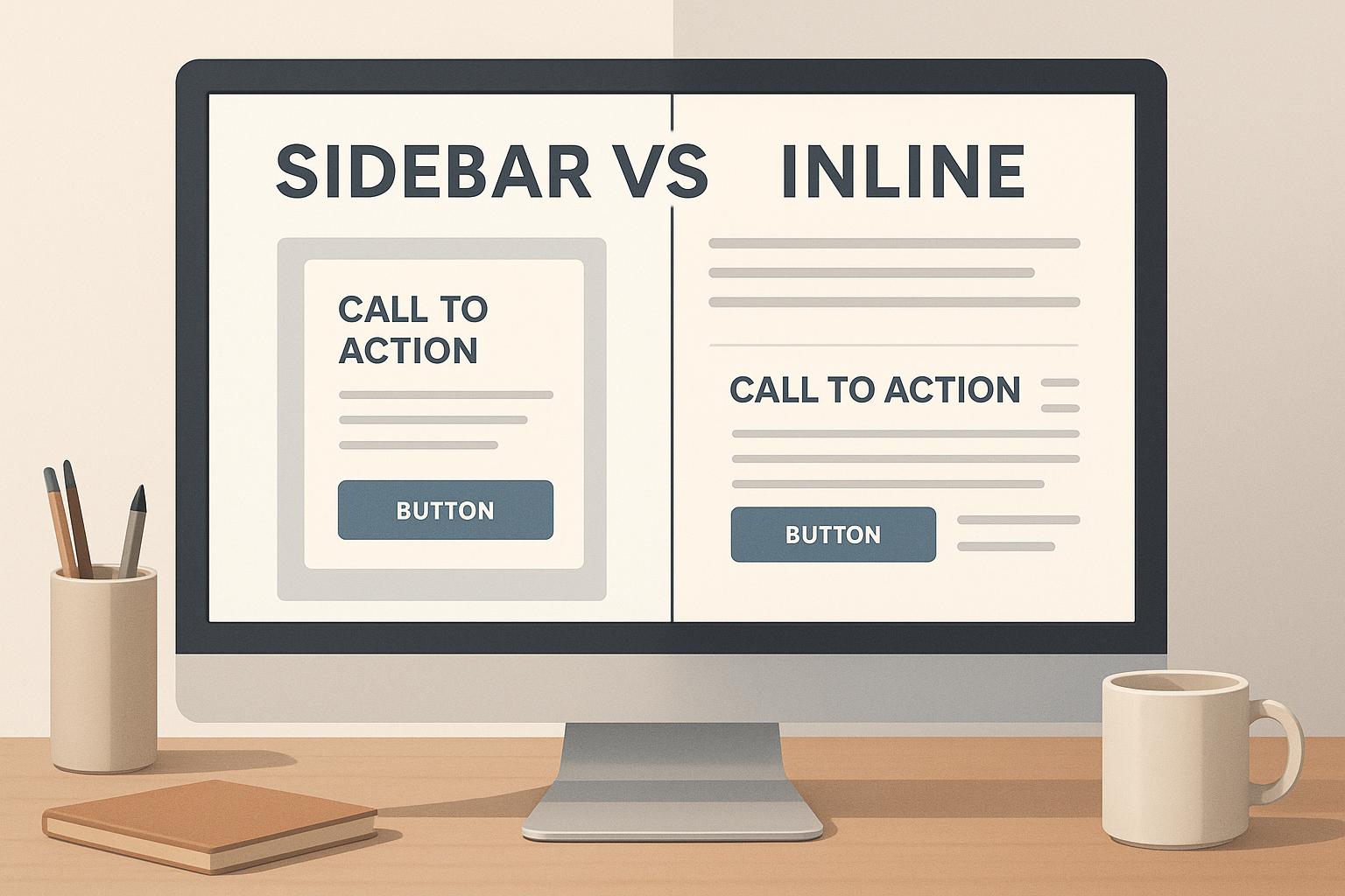
Sidebar vs Inline CTAs: Key Differences
Jul 3, 2025
Explore the differences between sidebar and inline CTAs, their effectiveness, and how to strategically use both for better engagement and conversions.

5 Types of Behavioral Triggers in Marketing
Jul 5, 2025
Explore the five key types of behavioral triggers in marketing that enhance customer engagement and drive conversions through personalized experiences.

Top 9 Tools for Measuring Twitter ROI
Jun 30, 2025
Explore the top tools for measuring Twitter ROI, enhancing your social media strategy with actionable insights and performance analytics.

How To Collect Feedback For Content Strategy
Jul 9, 2025
Learn effective strategies to gather and leverage audience feedback for enhancing your content strategy and boosting engagement.
Mobile-First Design: 7 Key Principles
Jun 22, 2025
Learn essential mobile-first design principles to enhance user experience, boost performance, and ensure accessibility across all devices.

5 Steps to Align Brand Values with Storytelling
Jul 2, 2025
Learn how to connect with customers by aligning your brand values with storytelling through five actionable steps.

7 Steps To Build A Startup Brand Story
Jul 22, 2025
Learn how to craft a compelling brand story for your startup that resonates with audiences and drives loyalty through authentic connections.

7 Tips for Writing Mobile-Friendly Emails
Jul 21, 2025
Learn how to craft mobile-friendly emails that boost engagement and avoid losing readers with practical design and formatting tips.

How to Scale Google Ads with Dynamic Remarketing
Jul 7, 2025
Learn how to effectively scale your Google Ads with dynamic remarketing to improve engagement and boost conversion rates.

Ultimate Guide to YouTube Tags and Keywords
Jun 25, 2025
Learn how to optimize your YouTube videos with effective tags and keywords to boost visibility and reach your target audience.
Scroll Depth Tracking: Setup Guide
Jul 1, 2025
Learn how to set up scroll depth tracking to enhance user engagement insights and improve your website's performance.

5 Steps to Plan Joint Marketing Campaigns
Jun 23, 2025
Learn how to successfully plan joint marketing campaigns with clear goals, defined roles, and effective monitoring to achieve better results.

User Journey Mapping for Content Strategy
Jun 26, 2025
Learn how user journey mapping can enhance your content strategy by aligning with audience needs at every stage of their interaction with your brand.

Top 7 Metrics for Measuring Ad Creative Performance
Jul 4, 2025
Learn the essential metrics for measuring ad creative performance and optimizing your marketing campaigns effectively.

What Is Email Bounce Rate And Why It Matters
Jun 29, 2025
Understanding email bounce rates is crucial for effective email marketing; high rates can damage your sender reputation and reduce engagement.

What Are Page Views and How to Track Them
Jul 6, 2025
Understanding page views is essential for improving website engagement and revenue. Learn how to track and analyze this key metric effectively.